Our recent paper in Nature summarizing the work of the Dark Diversity Network contains a simple – and for that reason rather horrifying – graph. It’s not much more than a linear regression, a line through some points:
It summarizes the relationship between the Human Footprint Index – a measure of the human modificiation of the landscape at a coarse scale – and the percentage of suitable plant species in our Dark Diversity plots.
That percentage is something unique: the network’s elaborate monitoring design was set up in such a way that we could estimate the total potential species pool of an area. The graph shows the percentage of that total species pool that was actually present at the site.
Now, what surprises nobody: the graph shows a steep decline – from around 35 to 20 % – in that percentage between sites without a human footprint up till an index of eighteen. Humans remove species from the land – clear and simple. What makes this analysis unique is that we find this after correcting for the potential of a certain area, and thus only look at the loss in potential, not the total loss of species. That correction is necessary to unearth these strong patterns, otherwise they get lost in the high variability in species diversity worldwide.
Now, the shape of the graph: a strong decline in realized diversity potential with increasing human footprint – is likely not a surprise to anyone. Nevertheless, it’s a story that needs repeating: it is the direct imprint of humans on a landscape that kills its diversity and it is that human footprint that we’ll have to keep fighting if we want to turn the tide for global biodiversity.
Now, how to win that fight in our multifunctional landscapes where biodiversity rarely plays the first violin, that’s a different story. But I am here to keep fighting that fight!
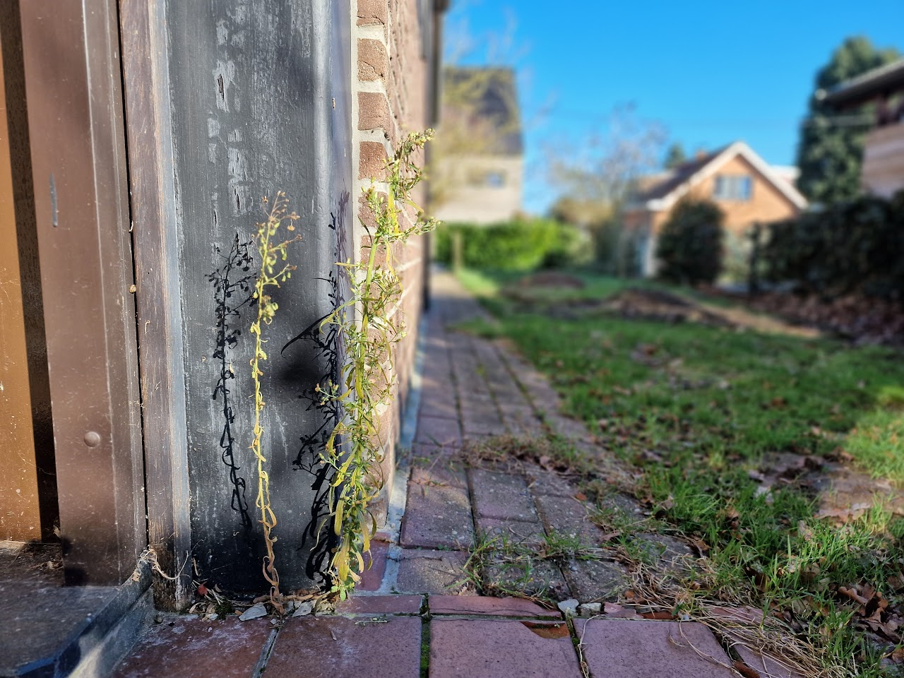
Back in 2019, we ventured into the field with a rather unusual mission: to search for the biodiversity that wasn’t there. At first glance, this might seem counterintuitive – after all, we’re accustomed to documenting what exists. Yet, by exploring what is absent, we uncover a narrative of loss and missed ecological opportunities.
The idea of measuring missing biodiversity originated in Estonia and is termed “dark diversity.” This concept doesn’t refer to the simple absence of all species – like the glaring lack of palm trees in a Flemish heathland – but rather to those species that could theoretically flourish in an environment, yet remain missing. In essence, dark diversity represents the shadow of potential life that hints at both historical losses and unrealized natural potential.
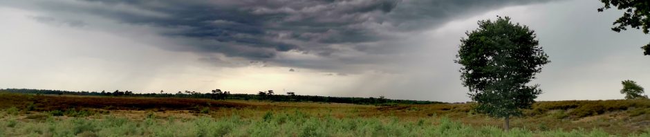
Dark clouds over our dark diversity field site in a Flemish heathland. This particular plot was undergoing active restoration – future work will show us how much of the dark diversity would have returned.
To delve deeper into this phenomenon, the Dark Diversity Network set out on a global journey. Using a unique survey design and specifically developed statistical methods, the network aimed to distinguish between species that should be present and those that are not. The culmination of this effort was the publication of a first large-scale paper in Nature, whose findings are as unsettling as they are revealing.
Now, drawing on data from over 200 scientists, the network spans nearly 5,500 sites across 119 regions worldwide. This extensive collaboration exposed the hidden toll of human activities on natural vegetation. In ecosystems with minimal human interference, more than one-third of the potentially suitable species are present, with the remainder missing largely due to natural constraints like limited dispersal. By contrast, in areas heavily impacted by human activity, only one in five suitable species is found.
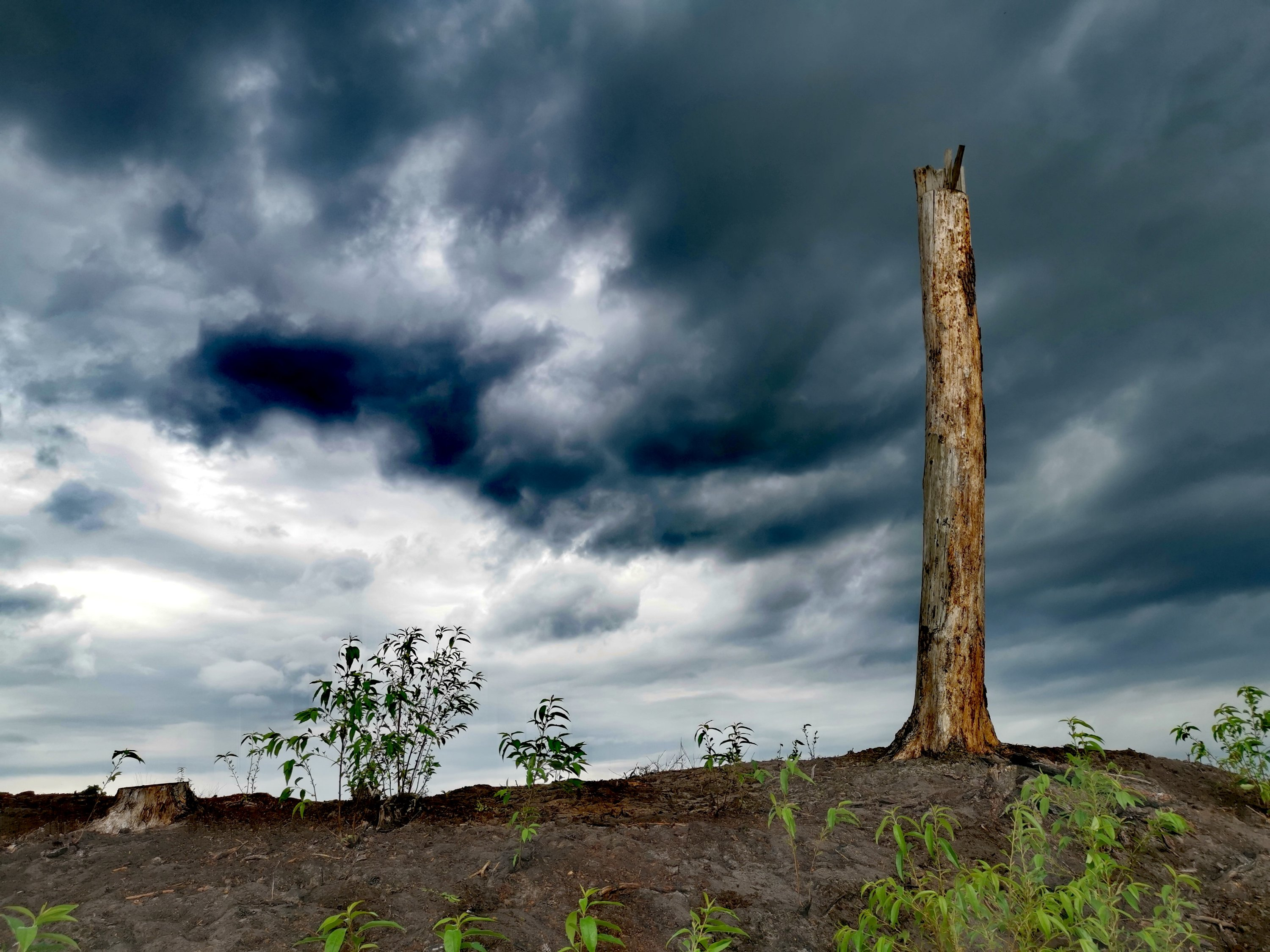
Area in northern Norway in which dark diversity is still low, thanks to the low human footprint.
Traditional biodiversity assessments – often based solely on the number of species recorded – failed to capture this nuanced decline. Such methods obscure the true impact of human disturbance by not accounting for the inherent potential of a given ecosystem. Instead, the study’s approach, which integrates the concept of dark diversity, reveals a far more comprehensive picture of ecosystem health.
Central to this research was the use of the Human Footprint Index, a composite metric that evaluates human population density, land-use changes (including urban development and agriculture), and infrastructure elements like roads and railways. The study demonstrated that as the Human Footprint Index increases, plant diversity diminishes—not only within the immediate vicinity but also across surrounding regions, sometimes extending hundreds of kilometres away.
Distribution of research sites in the DarkDivNet, and the relationship of the realized biodiversity potential as a function of the Human Footprint Index.
These findings are alarming, as they reveal that human disturbances extend well beyond urban centers -even infiltrating protected nature reserves. Pollution, logging, littering, trampling, and human-induced fires can drive plants from their native habitats and hinder natural recolonization. Notably, the adverse effects of human activity were less severe when at least one-third of the surrounding landscape remained pristine – a threshold that reinforces the global objective to safeguard 30% of our land.
This study underscores the importance of nurturing ecosystem health at a landscape level, not just within the confines of nature reserves. It’s clear that large-scale environmental dynamics significantly shape local biodiversity. This fits in neatly with the MicroFracNet we recently launched, an initiative dedicated to exploring biodiversity patterns across scales and deciphering how various drivers determine species presence or absence. We warmly welcome anyone interested in joining this exciting project!
Conceptual approach summarizing the calculation of the dark diversity species pool
Non-native species have been widely studied for decades, and their affinity with urban environments is no surprise to anyone in the field. However, just how many non-native species dwell in our cities was so far unknown. With a global consortium of invasion ecologists, we set out to map this invasion in cities around the world – starting with a simple count of non-native species. The results are as impressive as they are concerning.
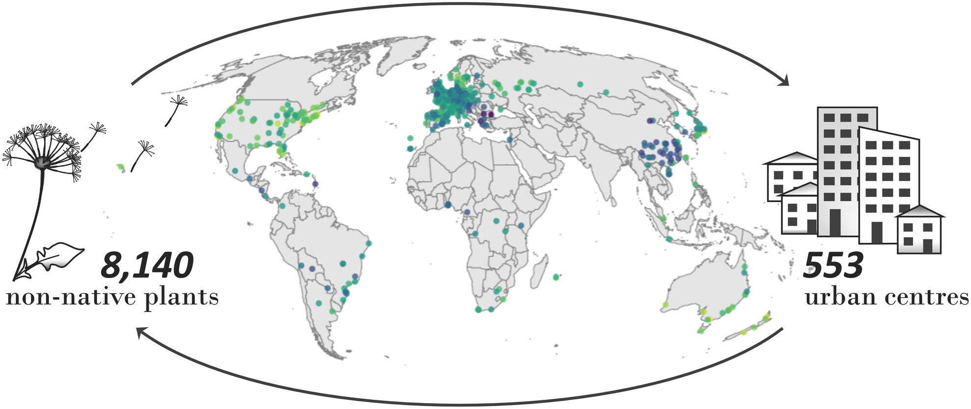
Our approach was straightforward enough: count the number of non-native plant species in various cities. By examining 61 countries, we obtained a clear snapshot of the impact non-native flora is having on urban environments. The full tally: 8140 species from 553 urban centres across the globe!
Numbers were particularly high in cities across the United States and Australia, while in Europe, London led the count. In the Netherlands – my new scientific home – we identified no fewer than 860 non-native species, ranking our country 15th among the 61 nations examined. However, it’s important to note that these figures reflect both the extent of invasion and variations in sampling intensity, so they should be interpreted with caution.
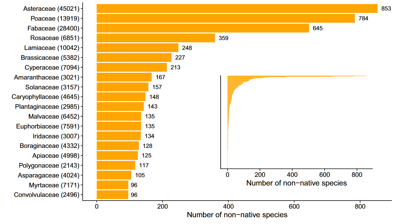
No surprises in the number of non-native plant species per family, with the Asteraceae, Poaceae and Fabaceae as so often leading the ranks
What is particularly interesting, however, is which species are leading the dance. The usual suspects, of course, with the overall record holder being the Canadian finebeam (Erigeron canadensis), a scrawny little thing of no apparent beauty that was found as a non-native in a mindboggling 469 cities across 47 countries. Its ability to thrive in diverse climates and urban settings is both fascinating and concerning.
The Canadian finebeam showing its best side at my back door. Interesting to realize it’s growing as a non-native speices between tiles of at least 469 cities worldwide!
Number 2? Veronica persica, still found in 41 countries. Exactly the reason why we studied its performance in urban settings in a previous paper!
The innocent-looking blue flower of Veronica persica in our pot experiment.
What do these numbers mean for our cities? They provide valuable insights for urban policy while raising pressing questions about the resilience of our ecosystems. How will we manage the growing presence of non-native species, and what can we learn from the Canadian finebeam’s success?
Our new database paves the way for future studies and policy discussions. By mapping non-native plant invasions, it offers key data and tools for comparative assessments, hypothesis testing (like biotic resistance or invasion debt), and even modeling invasion dynamics. Ultimately, this resource supports informed decision-making in conservation, ecosystem restoration, and sustainable urban management.
An add-on to the global EcoFracNet monitoring protocol
Call to action: Monitor plant biodiversity and microclimate using a standardized design across scales from 0,5 m to 900 m to help us assess the scales at which biodiversity varies, and at which scale it matters for ecosystem functioning.
Main contact person: Jonas Lembrechts, Utrecht University, the Netherlands. j.j.lembrechts@uu.nl
Join the networkby filling out the 30 second sign-up form here!
The Ecological Fractal Network (EcoFracNet) explores how ecological patterns and processes scale across space and time using a standardized fractal design with nested plots. While the original design spans plot distances from 100 to 900 m, many landscapes – especially fragmented ones in multifunctional landscapes – demand a closer look. Small-scale ecological complexity is equally critical in topographically diverse regions like mountains or Arctic tundra, where fine features such as hummocks and hollows shape biodiversity (Fig. 1).
To address these needs, we developed the MicroFracNet add-on, which enhances EcoFracNet by zooming in on fine-scale heterogeneity. By adding plots at 11 and 33 m within the original 100-meter units, MicroFracNet captures trends often overlooked at larger scales (Fig. 2). This approach incorporates the observations made in the EcoFracNet about the complexity of many landscapes, and expands the focus beyond large natural patches to fragmented habitats and unconventional havens for biodiversity, such as gardens, schoolyards, urban spaces, and farmland—ensuring no biodiversity is left behind.
Each plot remains a 1×1 m vegetation survey area, subdivided into four quadrants for detailed data collection. Wherever possible, link biodiversity patterns to microclimate variability by installing sensors (e.g., TOMST TMS4, Fig. 3) in key plots (see ‘microclimate protocol’ on the EcoFracNet-website). This high-resolution monitoring can further be integrated seamlessly with other EcoFracNet protocols like the bird and butterfly surveys already on the website. We also aim to incorporate additional measures such as decomposition (tea bags) and soil nutrient analysis, for which protocols will be added to the website later.
Figure 1: The scale of heterogeneity in a landscape varies widely and plays a crucial role in shaping ecological patterns and processes. In topographically complex regions like northern Norway (left), fine-scale features such as slopes, ridges, and valleys influence biodiversity. In agricultural landscapes (center), monocultures dominate, often creating large-scale homogeneity with little structural variation, as seen here on a misty morning in the Netherlands. In such landscapes, however, fine-scale fragmented patches of nature might still play crucial roles. In contrast, urban environments (right), exemplified here by Maastricht, Netherlands, exhibit extreme small-scale variability due to the diverse land uses and structural complexity of the built environment.
We are already piloting MicroFracNet at multiple sites across the Netherlands, developing a high-resolution case study to explore local biodiversity and ecosystem dynamics. We now however welcome both Dutch as well as international collaborators to join, as expanding the network globally will enable cross-regional comparisons of heterogeneity and enhance our understanding of how ecological patterns scale across diverse landscapes.
You can find a detailed version of the plot design here. For further guidance on setting up your study sites, identifying plot locations using GIS, conducting vegetation and microclimate monitoring, data sheets for data submission and exploring potential add-ons, refer to the original EcoFracNet protocols (Ecological Fractal Network – Protocol).
Join the networkby filling out the 30 second sign-up form here!
By joining the network you will:
Have the opportunity to be part of at least one joint paper on the spatial scale of heterogeneity and its implications for biodiversity (Fig. 4).
Join an international community using a shared data standard to understand spatial scaling.
Automatically have your data be eligible for inclusion in the wider EcoFracNet database.
Figure 2: MicroFracNet study design. The study design builds on the standard EcoFracNet framework by incorporating additional plots within the core bottom triangle (open circles), spaced at distances of 33 and 11 m from each other. Each plot consists of a 1×1 m vegetation survey area, consistent with the standard EcoFracNet methodology, and is further divided into four quadrants for detailed analysis (see inset, bottom right). Plots in red should – as much as possible – be prioritized. However, in areas of 500 x 500 m or less, one could also limit themselves to the bottom triangle only. Note that the orientation of the triangle can be adapted to local conditions.
Figure 3: if possible, augment the plant biodiversity monitoring with microclimate sensors (here a TOMST TMS4), to help us quantify heterogeneity in environmental conditions that underlie heterogeneity in biodiversity.
Figure 4: Preliminary findings reveal high community dissimilarity even at the smallest spatial scales within a 0.4 ha nature reserve at Utrecht Science Park, the Netherlands. The red line highlights the increased dissimilarity driven by fine-scale variation in management practices, specifically differences in mowing regimes.
Scientific research often presents itself as a search for truth—rigorous, objective, and driven by data. But what if the same dataset, analyzed by different researchers, leads to different conclusions? That’s exactly what happened when a group of ecologists, including myself, took part in an ambitious experiment. An experiment in which we ourselves – the ecologists – were the test subjects. Our main goal? Testing the reproducibility of ecological data analysis. The results are now out in BMC Biology, and they are as fascinating as they were humbling.
A team effort in data exploration
I joined this project as an opportunity for my students to together learn how best to apply statistical models to real-world ecological datasets, taking it on as a collaborative activity with The 3D Lab. The premise was simple: multiple research teams around the world would analyze the same dataset, aiming to answer the same research question. It was an exciting challenge—what patterns would we uncover? How would our results compare to those of others?The hypothesis being, of course, that whoever analyzed the dataset should come to the same conclusion. There are scientific truths behind such data, right? Right?
The two datasets
The study focused on two different ecological questions:
Blue tits – Does the number of young birds in a nest affect their growth?
Eucalyptus seedlings – Is there a relationship between the number of seedlings in a plot and the proportion of grass cover?
Our The 3D Lab-team dove into the dataset of the Eucalyptus seedlings – the trickiest one of the two. The blue tit dataset was relatively straightforward. Most researchers identified a negative correlation—young birds grew less when they had more siblings. However, here we had it already: there was significant variation in the strength of the correlation, and a few researchers even found a positive relationship!
The eucalyptus dataset was an even messier affair. While the overall pattern suggested only a weak relationship between seedlings and grass cover, a third of the researchers found either a positive or negative correlation. Some even identified strong relationships in opposite directions. These inconsistencies highlight a critical issue: the methods we choose can significantly shape the results we get.
Mindboggling graph if you wrap your head around it: an overview of the standardized effect sizes from all the analyses for the blue tit (left) and Eucalyptus (right) dataset. The blue tit dataset shows quite some agreement on the fact that the relationship was negative, yet with substantial variation towards the size of the effect, and even a few positive outliers. The Eucalyptus dataset on the right showed on average a slight, usually non-significant negative relationship, but with strong negative and positive outliers!
Why do results differ?
At first glance, these discrepancies might seem alarming. But they are not necessarily a sign that ecologists are bad at statistics – although that could contribute to it. Instead, they reflect the complexity of ecological data. Nature is noisy—environmental variables interact in intricate ways, making it difficult to draw clear-cut conclusions.
Importantly – in support of us statististicing ecologists, the study also found that researchers who reached unusual conclusions did not necessarily make methodological errors. We did indeed find substantial variation in the variable selection and random effects structures among analyses, as well as in the ratings of the analytical methods by independent peer reviewers, but we found no strong relationship between any of these and deviation from the meta-analytic mean (i.e., likely ‘wrongness’ of the analysis). This suggests that small choices—such as selecting a particular statistical test or data transformation—can have a big impact on the final conclusions.
Perhaps peer review isn’t the best approach to detect outliers in the statistical analyses? The peer review process (with a reviewer seeing somewhere between one and eleven studies) showed no significant correlation with how strongly of an outlier the reported effect size was.
What can we learn from this?
One of the biggest takeaways from this study is that statistics is not a magic wand. While it is a powerful tool, it does not eliminate uncertainty. This means that, as ecologists, I believe we should be more open about the limitations of our analyses and avoid blindly chasing statistical significance. The common threshold of p < 0.05 should not be treated as the sole indicator of truth.
Instead, robust research relies on multiple approaches:
Replication – The more times an effect is observed, the more confidence we can have in it.
Different methods – If different analytical techniques point in the same direction, the pattern is more likely to be real.
Transparency – Clearly documenting our choices helps others understand how we arrived at our conclusions.
Staying critical – even (or especially) of our own work
Personally for me, this study served as a reminder to stay critical of my own results. It’s easy to get excited when we find a nice correlation, but are we considering the full range of possible interpretations? Couldn’t we have made a series of equally-valid other methodological decisions, and what would have happened to our results then? Since participating in this project, I’ve made a habit of as much as possible explicitly acknowledging uncertainties in my papers. Perhaps more importantly, even, I now always use this example in my teaching, encouraging students to think about how different analyses can lead to different outcomes. Now there first statistical model they make as part of my team is one using the messy Eucalyptus dataset, showing them how we can in good consciousness report about the weak correlation in there.
Ecology is a science of patterns, processes, and probabilities. While we may never achieve absolute certainty, recognizing the sources of variability in our analyses makes us better scientists. And perhaps, a little more humble along the way.
Reference: Gould, E., Fraser, H.S., Parker, T.H. et al. Same data, different analysts: variation in effect sizes due to analytical decisions in ecology and evolutionary biology. BMC Biol23, 35 (2025). https://doi.org/10.1186/s12915-024-02101-x
PS: note that this manuscript was published as a ‘registered report’, which means that it is a peer-reviewed research article from which study plans, including hypotheses and methods, were reviewed and accepted before the actual work was done, ensuring transparency and reducing publication bias. Pretty cool, huh!
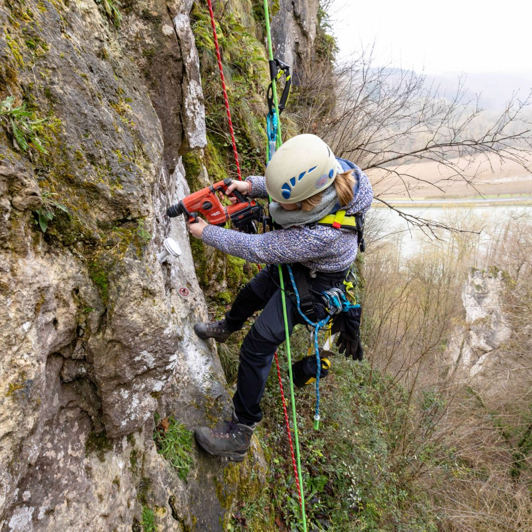
Not all fieldwork pictures are equally breathtaking. While part of our team waded through the muddy mud of De Driehoek – one of our university campus’s last patches of nature – another group embarked on a rather more inspiring mission: retrieving microclimate sensor data from the cliffs of Freyr, Belgium’s highest rock wall. The pictures I received from them, made by photographer Kobe Burdack, might just be what you needed to want to join the project…
Last summer, as part of our MIREN Rocks project, we – well, not me… – monitored plant biodiversity on these cliffs to study rock vegetation worldwide. Our research explores the impact of climbing, species diversity, and the role of rock microclimates in shaping these unique ecosystems.
Master student Sarane preparing to rappel down to the sensor. Pictures by Kobe Burdack.
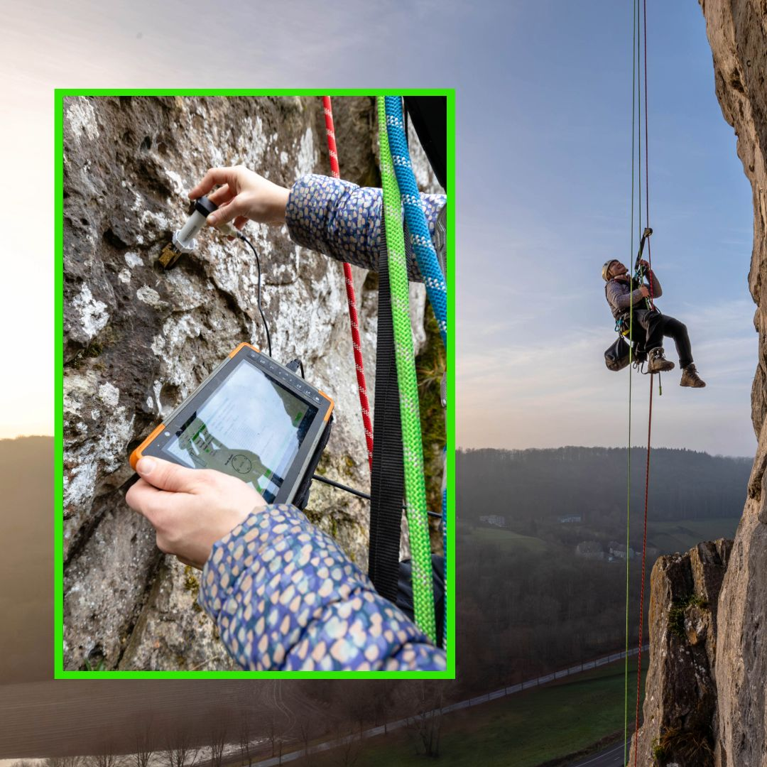
To track temperature fluctuations, we use TOMST Thermologgers, securely mounted to the rock face. These sensors are read using a Juniper Systems Mesa 2 field computer—compact enough to be carried to heights of more than 100 meters! However, installing them was far from simple. Unlike in more accessible terrains, this task required rope access techniques, high-quality climbing gear, and a reliable mounting method—eventually, drilling a hole proved most effective.
Drilling a hole for secure sensor installation. Pictures by Kobe Burdack.Reading out TOMST Thermologgers high above the river Meuse. Pictures by Kobe Burdack.
The MIREN Rocks project is always looking for new participants to expand our surveys to rock faces around the world. Do you have a background in ecology or botany, and are you comfortable climbing or working at heights? Join the survey! Visit our website for more details: https://www.mountaininvasions.org/miren-rocks
Young bluebell (Hyacinthoides non-scripta) surrounded by flowers of yellow archangel (Lamium galeobdolon)
The common bluebell (Hyacinthoides non-scripta), the signature flower of the Hallerbos
Single bluebell flower surviving on a wetter spot, as indicated by the field of wild garlic (Allium ursinum)
A really wet patch of forest, with giant horsetail (Equisetum telmateia) in a field of wild garlic (Allium ursinum)
Wild garlic (Allium ursinum) in the Hallerbos flowers a bit later than the bluebells, yet this one was already in full bloom
A bumblebee visiting yellow archangel (Lamium galeobdolon)
A bumblebee visiting yellow archangel (Lamium galeobdolon)
Wild garlic (Allium ursinum)
Wild garlic (Allium ursinum)
Weirdly beautiful, the inflorescence of pendulous sedge (Carex pendula), typical for the wettest spots in the forest
Weirdly beautiful, the inflorescence of pendulous sedge (Carex pendula), typical for the wettest spots in the forest
A little stream in the Hallerbos, surrounded by endless fields of wild garlic (Allium ursinum)
The herb-paris (Paris quadrifolia), less common in the forest
Wild garlic (Allium ursinum)
Bluebells (Hyacinthoides non-scripta)
Weirdly beautiful, the inflorescence of pendulous sedge (Carex pendula), typical for the wettest spots in the forest
Another one from the wet plots: large bitter-cress (Cardamine amara)
Another one from the wet plots: large bitter-cress (Cardamine amara)
Young beech leaves, as soon as they are fully grown, spring in the understory is over
A beech forest without understory, most likely too dry and too acid for any survivors
A young beech seedling (Fagus sylvatica), looking nothing like a beech, yet everything like a tiny dancer
Young beech seedling (Fagus sylvatica)
Bluebells (Hyacinthoides non-scripta)
Bluebells (Hyacinthoides non-scripta)
Bluebells (Hyacinthoides non-scripta)
Mountain melick (Melica nutans), a grass in the most amazing green
Bluebells (Hyacinthoides non-scripta) in a rare patch of mountain melick (Melica nutans), a grass in the most amazing green
Bluebells (Hyacinthoides non-scripta)
Bluebells (Hyacinthoides non-scripta)
Montpellier 2017
The entrance to the cathedral of Montpellier
The cathedral of Montpellier
The entrance to the cathedral of Montpellier
The cathedral of Montpellier
Narcissus poetics
The cathedral of Montpellier
The botanical garden of Montpellier
The botanical garden of Montpellier
The botanical garden of Montpellier
Brackish Camargue vegetation
Brackish Camargue vegetation
Brackish Camargue vegetation
A typical lagune
Brackish Camargue vegetation
Camargue horses
Camargue horses
Camargue horses
Brackish Camargue vegetation
Brackish Camargue vegetation
Brackish Camargue vegetation
Camargue horses
Brackish Camargue vegetation
Little egret in the evening sun
Flamingo’s in the evening sun
A typical lagune
Dandelion fuzz
Grass lily
Grass lily
Dandelion fuzz
Veronica in a sea of poplar fluff
Euphorbia in a sea of poplar fluff
Poplar
Gare du Midi, Brussels
Gare du Midi, Brussels
Gare du Midi, Brussels
Gare du Midi, Brussels
Sweden autumn 2016
Autumn in Abisko
Yellow leaves of mountain birch, with lake Torneträsk in the background.
Lapporten, the gate to Lapland, in Abisko
Rain blowing over the Abisko National Park
The colours of the north: red fireweed and yellow mountain birches, with lake Torneträsk on the background
Yellow leaves of mountain birch, with lake Torneträsk in the background.
Rain on the background, the ski lift in Abisko on the foreground
The steep slope of mount Nuolja on a dramatic looking morning
The beautiful colors of lake Torneträsk in Abisko
A little stream on top of the mountain, with a view on Lapporten, the gate to Lapland
Well, that is a beautiful table with a nice view on lake Torneträsk in Abisko
Our little experiment on top of the mountain in Abisko, with a view on Lapporten
Autumn in Abisko is extremely colorfull
The ski lift with a view on Abisko National Park and Lapporten
Hiking dowhill towards lake Torneträsk
This green is greener than the greenest green: moss on top of mount Nuolja
Well, that is a beautiful table with a nice view on lake Torneträsk in Abisko
The ski lift with a view on Abisko National Park and Lapporten
The ski lift with a view on Abisko National Park and Lapporten
The most beautiful hiking trail of the world: Nuolja in Abisko
Angelica archangelica, often the biggest plant of the Arctic
The most beautiful hiking trail of the world: Nuolja in Abisko
Cirsium helenioides, the melancholy thistle
Hiking down mount Nuolja
The steep slope of mount Nuolja on a dramatic looking morning
The colours of the north: red fireweed and yellow mountain birches, with lake Torneträsk on the background
The prettiest yellow and blue: autumn in Abisko
Fireweed, Epilobium angustifolium
Campanula or bellflower, I think ‘uniflora’
Vaccinium myrtillus
Cornus suecica, the prettiest red of the world
Hieracium alpinum, alpine hawkweed
Carex atrata, one of my favourite sedges
Alpine clubmoss, Diphasiastrum alpinum
Agrostis capillaris, bentgrass
Common yarrow (Achillea millefolium)
Anthoxanthum odoratum, sweet vernal grass, fully grown and mature
Snow scooter trail
Our plot in the mids of a field of horsetails (Equisetum pratense)
Equisetum pratense
Cliff overlooking the valley with the road to Norway
Seedling of Taraxacum officinale, the dandelion, after two years of growing in bad conditions
Poa alpina, the alpine meadow-grass, with its viviparous seeds
Massive flowerhead of Angelica archangelica
Angelica archangelica
Blueberry (Vaccinium myrtillus) in autumn
A lowland marsh in Abisko in autumn
Installing the plots of our trail observations on top of mount Nuolja
Installing the plots of our trail observations on top of mount Nuolja
Tanacetum vulgare (Tansy), non-native for the high north
Autumn forest down in the valley
The valley of Nuolja to Björkliden
Summer on the Nuolja-side
A full rainbow behind mount Nuolja in Abisko
It’s raining in the west, clouds trapped behind the mountains
A strong wind blowing rain from behind the mountains to our side
A strong wind blowing rain from behind the mountains to our side
Betula nana, the dwarf birch, mini autumn forest
Betula nana, the dwarf birch, mini autumn forest
The valley of Björkliden in autumn
The valley of Björkliden in autumn
The valley of Björkliden in autumn
The valley of Björkliden in autumn
Sweden spring 2016
Although the alpine zone has been harder for invasives to access than most places, human structures like trails are often an easy gateway for the invaders to get up there. Picture from Abisko, Swedish Lapland.
A rainy hike
Overlooking the valley of Laktajakka
Ranunculus glacialis
Bartsia alpina
The valley of the lakes
Silene acaulis
Cornus suecica
Trifolium pratense
Rubus arcticus
Trifolium repens
Dryas octopetala
Eriophorum vaginatum
Silene suecica
Western European species like the red clover (Trifolium pratense) here are often listed as non-native species in mountain regions.
Salix reticulata
Oxyria digyna
Melting snowpatch on a lake
Ranunculus glacialis
Amiens
Almost cold enough for ice-skating
The southern side
Cathedral with a glimpse of spring
House on the square before the cathedral
Cold!
Cathedral at night
Cathedral seen from the frozen Parc Saint-Pierre
Enjoying silence and the morning sun
Nice architectural curve
Cathedral at night
Winter sun on the Place du Don
The museum behind the beautiful gates
Cathedral at night
Le Club d’Aviron in winter weather
Frozen to the bone
View from my office window
Cathedral at night
View from my office window
Sunny but cold, the Quai Bélu
Sunny but cold, the Quai Bélu
Gargoyle planning to eat the cathedral
Maria without a shirt
Just outside of Amiens
Colourful mirror
Sun rising above the water
Frozen mirror
Amiens is filled with cute little houses
Sweden autumn 2015
Lichen
Sweden summer 2015
View on the 1000 meter plots
Doing research on a cold Arctic morning
Plots flooded by the snowmelt
Flooded by the snowmelt
Meltwater river, racing down the mountain
After a hike, even the most basic house looks cosy. Little hut in the mountains, open for everybody
Snowbridge, maybe don’t cross…
Snowbridge
View from a cliff
Silene acaulis or cushion pink, cutest plant of the Arctic
Two seasons in one image
Steep slope
Hiking down
Narvik Kirche, church of the subarctic
Narvik Kirche
Reindeer on top of the mountain
Narvik Kirche
Summer at the church
Summer flowers
Massive waterfall
Young willow catkins
View from Narvik’s hospital, with lilac flowers
Building a bridge over the fjord will gain al drivers at least an hour
Norwegian fjord
Posing with the water, getting soaked
Minimalistic mountains
Insect investigating our reindeer antler
Catching mosquitoes with our license plate, harvest of the year!
Posing with the plot
Fieldwork on the most beautiful spot of the world
Fieldwork on the most beautiful spot of the world
Summer bridge – still next to the sadly impassable river
Rhinanthus flower in the mountains
Plateau in the valley, beautiful brown
Experimental view from my favourite plot
Salix catkins
Extremely old Betula tree
Waterfall from a cliff
Buttercup is the earliest in spring, here
Rocks!
Alpine views
Views!
Fieldwork
Jumping over rivers
Plot
Golden plover
Angry lemming
Green, the whole north is green!
Snow, so much snow left!
Minimalistic mountain moments
Fieldwork
The research center
Red clover – focal invader
Look at this tiny cute snail!
Massive floods of melting water
Bartsia alpina
Hooray, a toilet!
Dryas octopetala
Lowest elevation plots
Butterball!
That’s a lot of water
Midnight sun is the best
At the lakeside
Beautiful Bistorta vivipara
Don’t fall in the water
Midnight sun
Wild river
Art – made by ages of wild rivers
Baby firework for America’s independence day
Midnight sun at the lake
The Abisko canyon was wilder than ever
That’s a crazy amount of water!
The Abisko canyon was wilder than ever
The Abisko canyon was wilder than ever
Black and white
Stone-man overlooking Abisko
Nothing as soft as a willow catkin
Label and soil temperature sensor attached
I’d drive to the top every day
Reflections
Rocks and clouds
Brave little birch
Brewing our camping poison
Basic camping stuff
Camping in Norway
Home-made temperature houses
Roadside research at its best
Norway is crazy
Horsetail is so funny
Little creek in magical forest
Birches, birches everywhere
Beautiful rock, a gift from the river
Another roadside fellow
Lichen
Ready to rock the summer
Collecting mosses
That’s a crazy old lichen
Tiny tiny piny trees, but old, so old!
Ready to jump into the fjord?
Ready to jump into the fjord?
That’s a spiky stone!
Views on Norwegian fjords
Silene in the mountains
Cute little orchid
Skua
Attacking skua, mind your heads!
Watch out for the attack of the fierce skua!
Black snail
New plot!
Still a lot of snow to melt, but this spot was free for a new plot
Reindeer are better than people
Two seasons in one picture
Let’s see what is happening to the balance in mountains! Is this a starting avalanche, or will it last a bit longer?
Cute little hut
Climbing mountains by car
Softest moss in history
Drosera in the marsh
Hiking in no-man’s land
The clouds are coming
Abisko valley
‘Butterball’
Fieldwork in the tundra
Abisko valley
Little plot
Clouds and sun and mountains
Making soup on a campfire with a view
Little creek on high elevations
Skua on the look-out
Melting snow in a river
Rhodiola rosea and the Törnetrask lake
Beginning of spring
Flooded plots, melting snow, impassible wetness
Ferns and horsetails
Chile 2015
Lunch made by our local colleague, with funny bread (tasty as well!)
Trips to the field sites were sometimes a real adventure, especially right after snowmelt


")


")
")


")


")


")


")


")


