How much hydrology hides in our microclimate sensors?

I’ve spent over a decade now sticking small microclimate loggers into the ground, mostly to talk about temperature. Soil moisture has always been the awkward third wheel in that story: TOMST loggers measure it too, our CurieuzeNeuzen in de Tuin citizen-science project collected it by the thousands, and yet I’ll be honest – until recently we had done remarkably little with it. Soil temperature is intuitive, comparable across studies, and (relatively) forgiving. Soil moisture is none of those things. It depends on soil type, on calibration, on what exactly you mean by “moisture” in the first place, is extremely variable and rarely statistically ‘normal’. So it sat there in our growing database, a bit unloved and ignored.

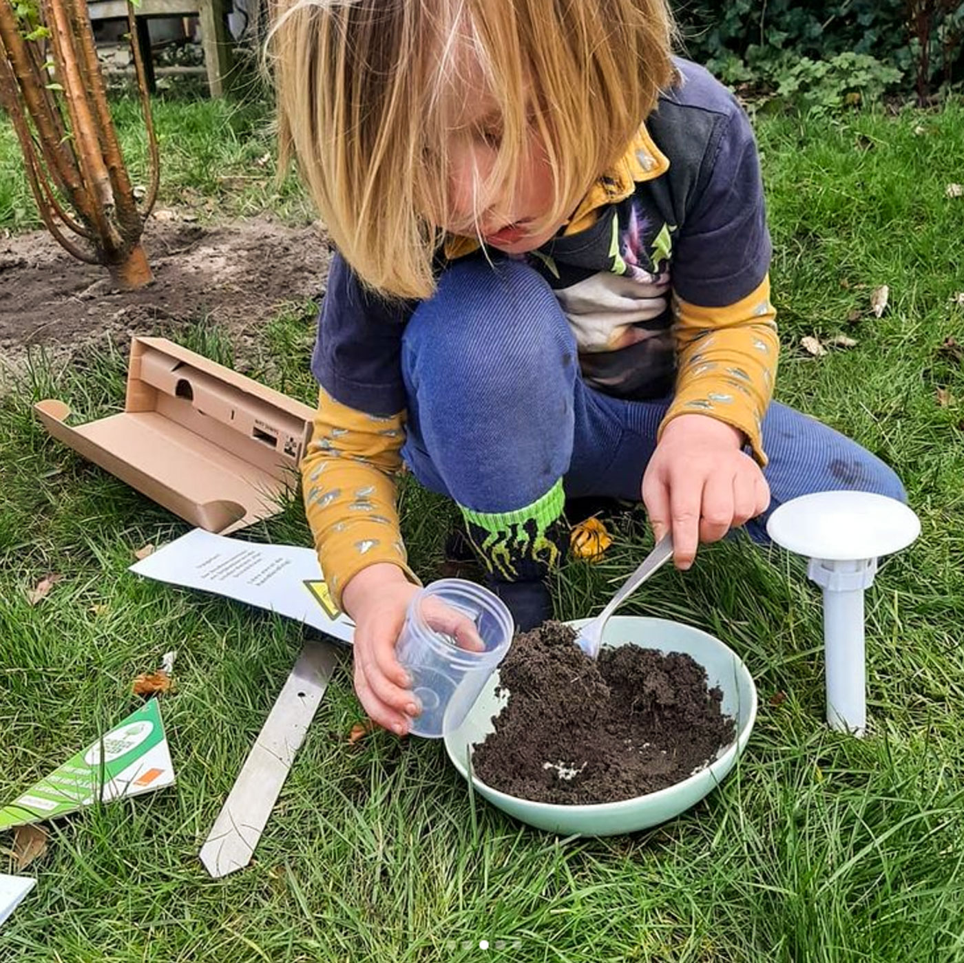
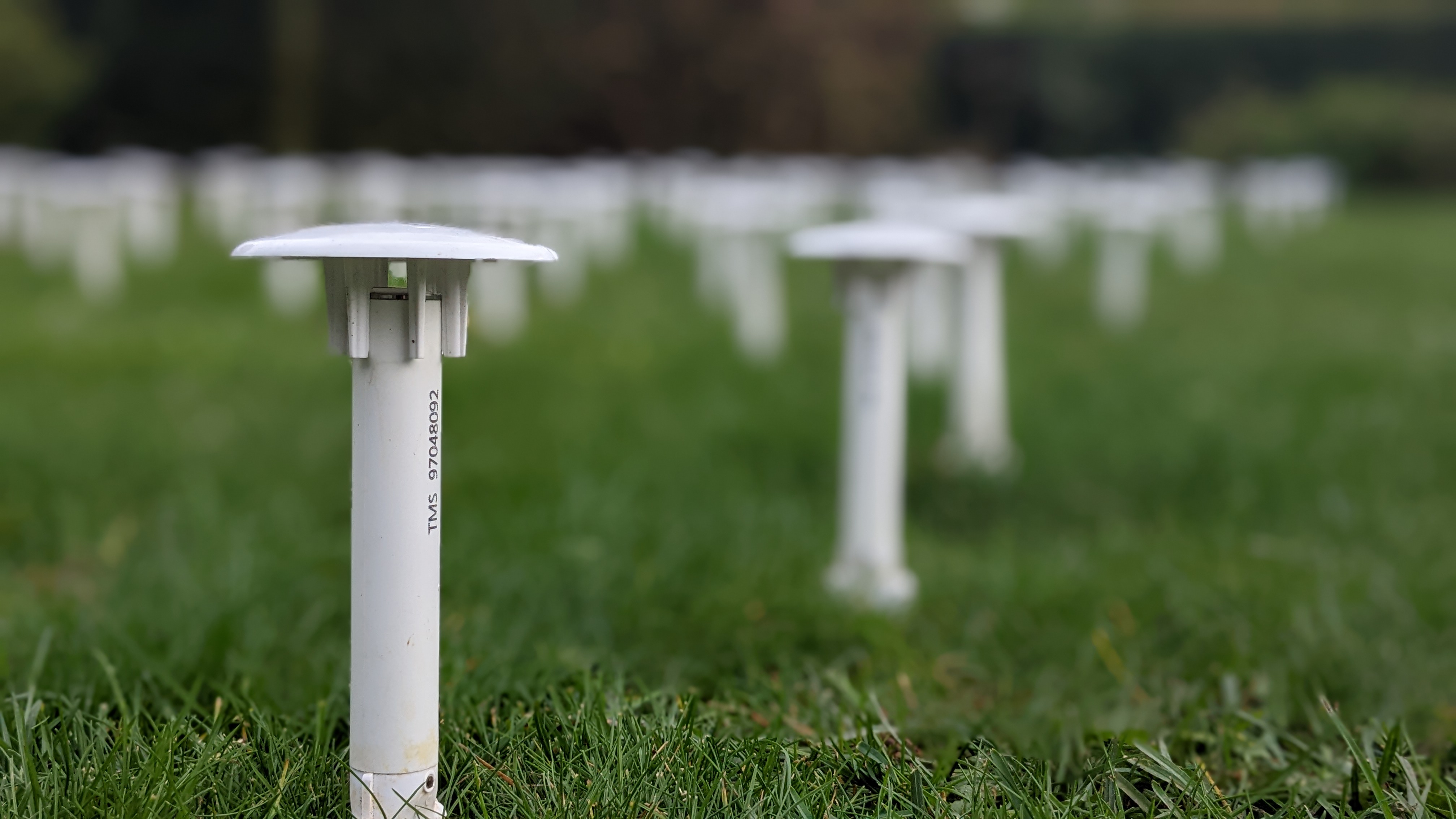
CurieuzeNeuzen in de Tuin citizen scientist collecting a soil sample, next to their TOMST TMS-NB ‘garden dagger’

That changed, fortunately, when the hydrologists at the Vrije Universiteit Brussel came knocking with a very interesting question: can our garden sensors tell us anything about groundwater?

Borrowing eyes from a different field

The premise of the collaboration (now published here!) was nicely elegant. They had already built and run mHM, a proper physically-based hydrological model, for the whole of Flanders. The kind of model that needs detailed climate forcing, soil maps, land use, and a fair chunk of computing time, and that spits out things one actually cares about for water management: groundwater recharge, evapotranspiration, degree of saturation. Variables for which you cannot simply stick a sensor into the ground and read off directly at the same low cost we do for temperature and soil moisture.

Meanwhile, we had thousands of CurieuzeNeuzen in de Tuin loggers with two summers of near-continuous, low-cost, noisy, wonderfully abundant soil moisture and temperature readings, measured in places a hydrological model would never normally get near: backyards, parks, the occasional forgotten corner behind company head quarters.

We got thousands of temperature and soil moisture sensors, which have up till now been used only for half their potential.

The question the VUB team asked was basically: if we feed a machine learning model nothing but our sensor time series – no rainfall, no radiation, no coordinates, just the lags, rolling means and differences of what the sensor itself reports – can it learn to reproduce what the full hydrological model would have said for that spot? In other words, how much hydrology is already implicitly encoded in a humble soil moisture logger, once you look at it the right way?

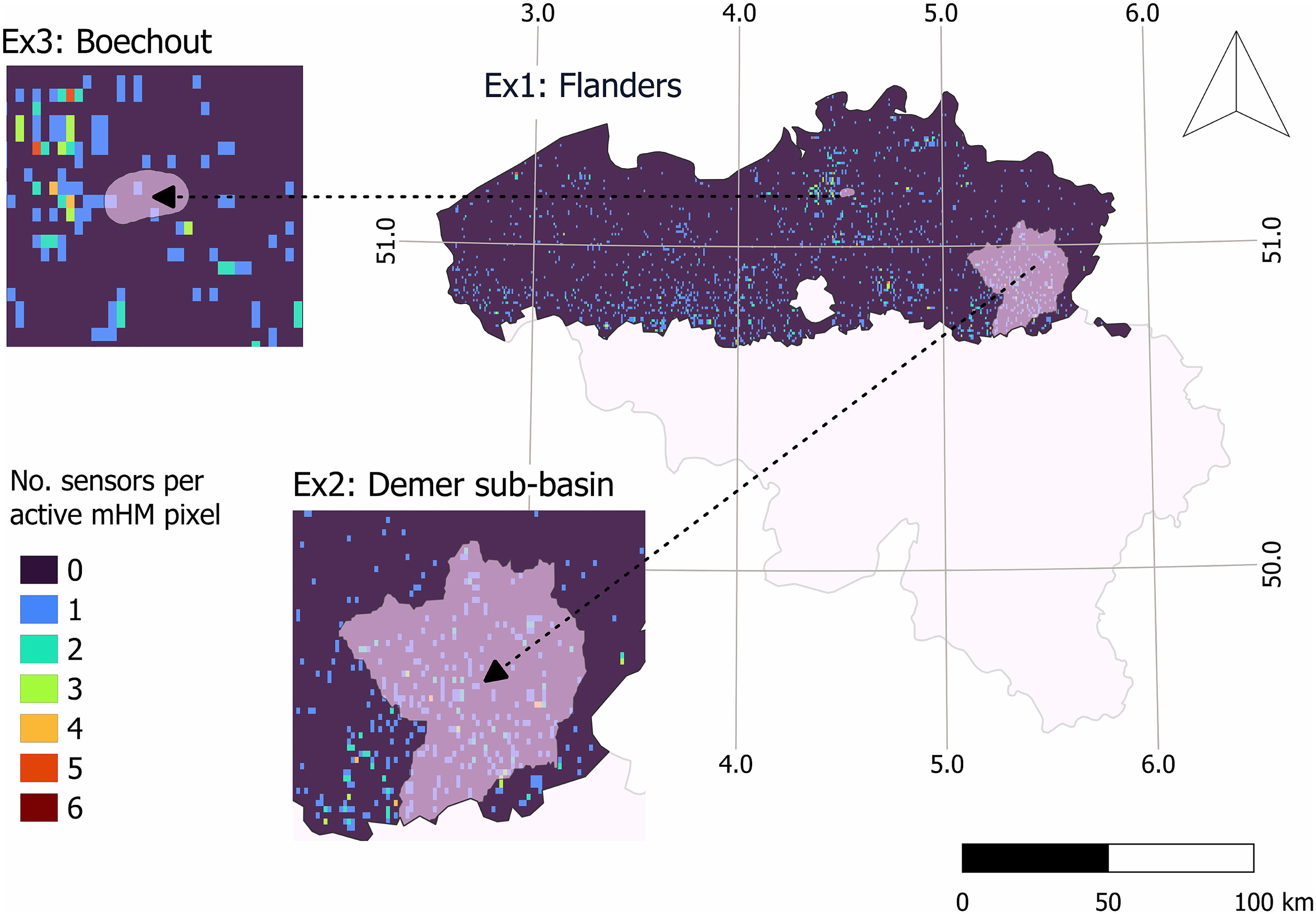
Where it all happened: the coloured speckles are individual CurieuzeNeuzen in de Tuin sensors scattered across Flanders, with the three test areas from the paper zoomed in — the whole region, the Demer sub-basin, and the small independent test site in Boechout.

The answer: quite a lot, especially in bulk

Using LightGBM (a fast, tree-based algorithm, chosen after testing a handful of competitors), they could indeed emulate mHM’s estimates of groundwater recharge, evapotranspiration and degree of saturation reasonably well at most sites, capturing the difference between the miserably wet year of 2021 and the properly dry year of 2022, catching the seasonal rhythm, keeping bias low. Not perfect, and definitely not a replacement for the real model (the paper is quite upfront about that), but good enough to be genuinely useful as a diagnostic and extrapolation tool.

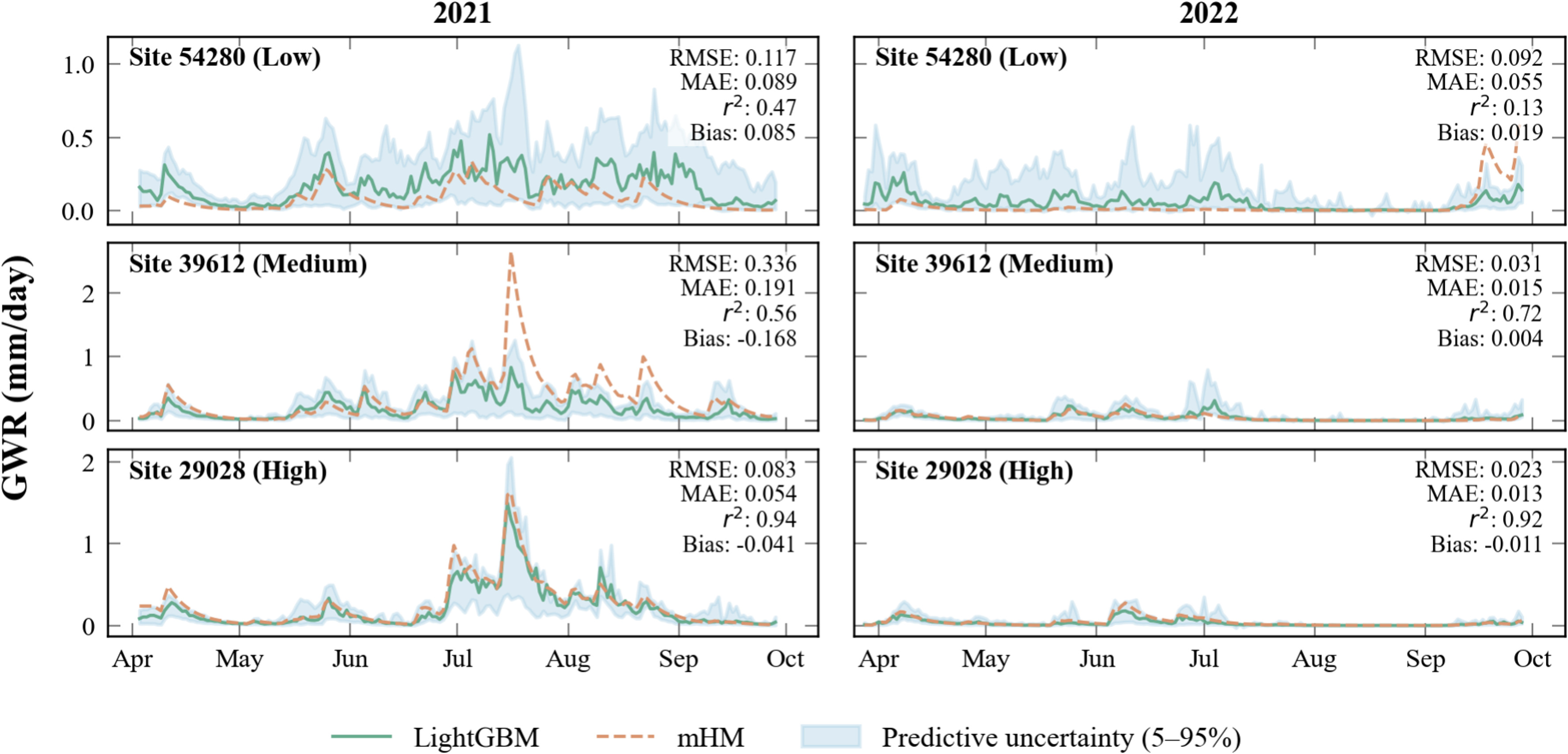
One of our better sites: our sensor-based machine learning model (green) tracking the “real” hydrological model’s groundwater recharge estimate (orange) almost peak for peak, in both a wet year (2021, left) and a dry one (2022, right). Not every garden did this well, but this is what it looks like when it worked out nicely!

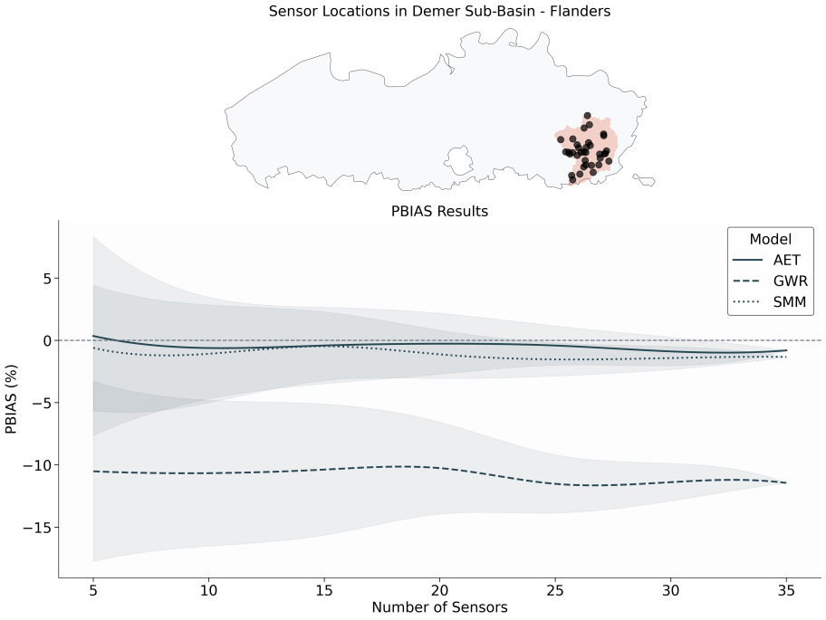
The part I find most interesting, though, is the following: on their own, individual sensors are a weak signal for this kind of hydrology – a single logger in one garden tells you a bit about that garden, yet very little about regional groundwater dynamics. Not a surprise there, as we knew the soil moisture signal was messy and hard to trust. But once you start aggregating across many sensors, the picture sharpens considerably: the density experiment in the paper shows that as more sensors get pooled together, the bias in the estimate stabilizes and the noise from single quirky locations melts away. It is, in the most literal sense, a case of the network being worth more than the sum of its parts. That’s reassuring to see in print, as that was the point I had been making about these sensors all along!

Pool just a handful of sensors (left side of the graph) and the bias estimate varies wildly depending on which ones you happened to pick (the shaded bands are wide). Add more sensors moving to the right, and average them together, and that uncertainty collapses, even though the mean bias barely moves. One noisy garden sensor tells you little; thirty-five of them, averaged, predict the truth.

There’s a nice practical postscript too: when the model, trained purely on 2021–2022 Flanders data, was applied to an entirely independent site near Boechout (Flanders) the following year, its recharge estimates tracked the ups and downs of actually measured groundwater levels pretty well. That’s the kind of transferability test that is very welcome to see.

Why this matters (to me)

For me personally (selfishly), this paper did two important things. First, it took our soil moisture data out of the drawer we had secretly already put it in (“nice to have, hard to use”) and showed it has real value beyond microclimate ecology – groundwater managers, drought forecasters and agricultural planners could plausibly use dense, low-cost (citizen-science) microclimate networks like this one as a genuine complement to expensive physical models, especially in places where running a full hydrological model isn’t feasible.

Second, it was just refreshing to watch hydrologists do to our data exactly what we do with vegetation or temperature data: squeeze out patterns we hadn’t thought to look for. Another example of where microclimate measurements can inform other disciplines, as we have showed before for many other applications.

There is plenty left to do, of course, and the paper has a whole lists of suggestions: we had no winter data (when most European recharge actually happens), no proper soil calibration (remains a bottleneck for the TOMST sensor soil moisture data), no guarantee the same approach transfers to a different climate or a different model. But as a first demonstration that “yes, there’s real hydrological signal buried in a network of €100 loggers, if you have enough of them and someone willing to dig it out” – I’ll take it!

Reference: Elsaidy, A., Lekarkar, K., Yimer, E.A., Van de Vondel, S., Lembrechts, J.J., Meysman, F.J.R., Zomlot, Z., Salvadore, E., Mogheir, Y., Huysmans, M., Van Griensven, A. (2026). How much hydrology is embedded in low-cost sensors? Machine-learning emulation of the mesoscale hydrological model from citizen soil moisture observations. Journal of Hydrology X. https://doi.org/10.1016/j.hydroa.2026.100225

Posted in Science | Tagged , , , , , , | Leave a comment

The MIREN road survey database

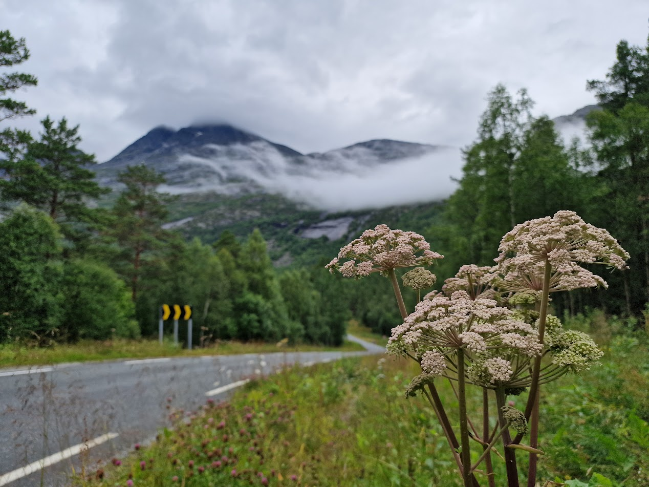
Can you imagine how many hours of roadside fieldwork went into this?

We’ve just published the MIREN road survey database, and the accompanying paper led together with Sylvia Haider: 170,000 georeferenced plant records, covering 6,854 vascular plant species across 3,364 plots in 25 mountain regions spanning every continent except Antarctica.

If you haven’t heard of the Mountain Invasion Research Network (MIREN) yet, now is the time to pay attention: since 2007, a growing number of dedicated MIRENers have gone out every five years to survey the vegetation along mountain roads in their region, building what has become one of the largest standardized vegetation monitoring datasets of its kind.

Figure 1: Location of the regions that have implemented the standardized road survey protocol of the Mountain Invasion Research Network (MIREN). Pie charts are scaled by species richness, with colours indicating the proportion of native and non-native plant species.

That massive dataset is now fully open access, with all data up to 2022 included.

If your first reaction is “wow, I wish I’d been part of that” — good news, this is your lucky day. We’re already preparing for the next round of monitoring in 2027, when virtually all of these regions (and a few new ones) will go out again to see what’s changed. Want to join with your favourite mountain region? Just send us a message!

Our 3,364 plots cover an impressive range of the world’s climatic space — though you can see mountain roads get hesitant once the “real deal” begins, with no plots in the tundra (1).

Reference: Haider, Lembrechts et al. (2026) The MIREN Road Survey Database: Standardized Vegetation Sampling to Advance Our Understanding of Biodiversity Responses in Mountain Systems Across the Globe. Global Ecology and Biogeography.

Posted in Science | Leave a comment

Big, rocky canaries in the coalmine

Mountain tops are big, rocky canaries in the coalmine that is our planet. Up there, above the last trees, change happens in real time and out in the open: plants, rock and climate, negotiating directly with each other. If you want to see the effects of a warming world with your own eyes, a summit is a very good place to start looking.

I’ve mentioned it many times on this blog: as the climate warms, species shift upward, chasing the cooler conditions they’re adapted to. It’s one of the most robust patterns in climate ecology. But (and by now you probably know that a “but” is never far away on this blog) the closer you look, the more complicated that story gets. A new paper I had the pleasure of contributing to, just out in Nature Ecology & Evolution, digs into exactly that mess, and the picture it paints is a lot more interesting than “it’s getting warmer, so warm-loving plants are winning.”

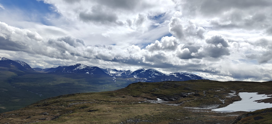
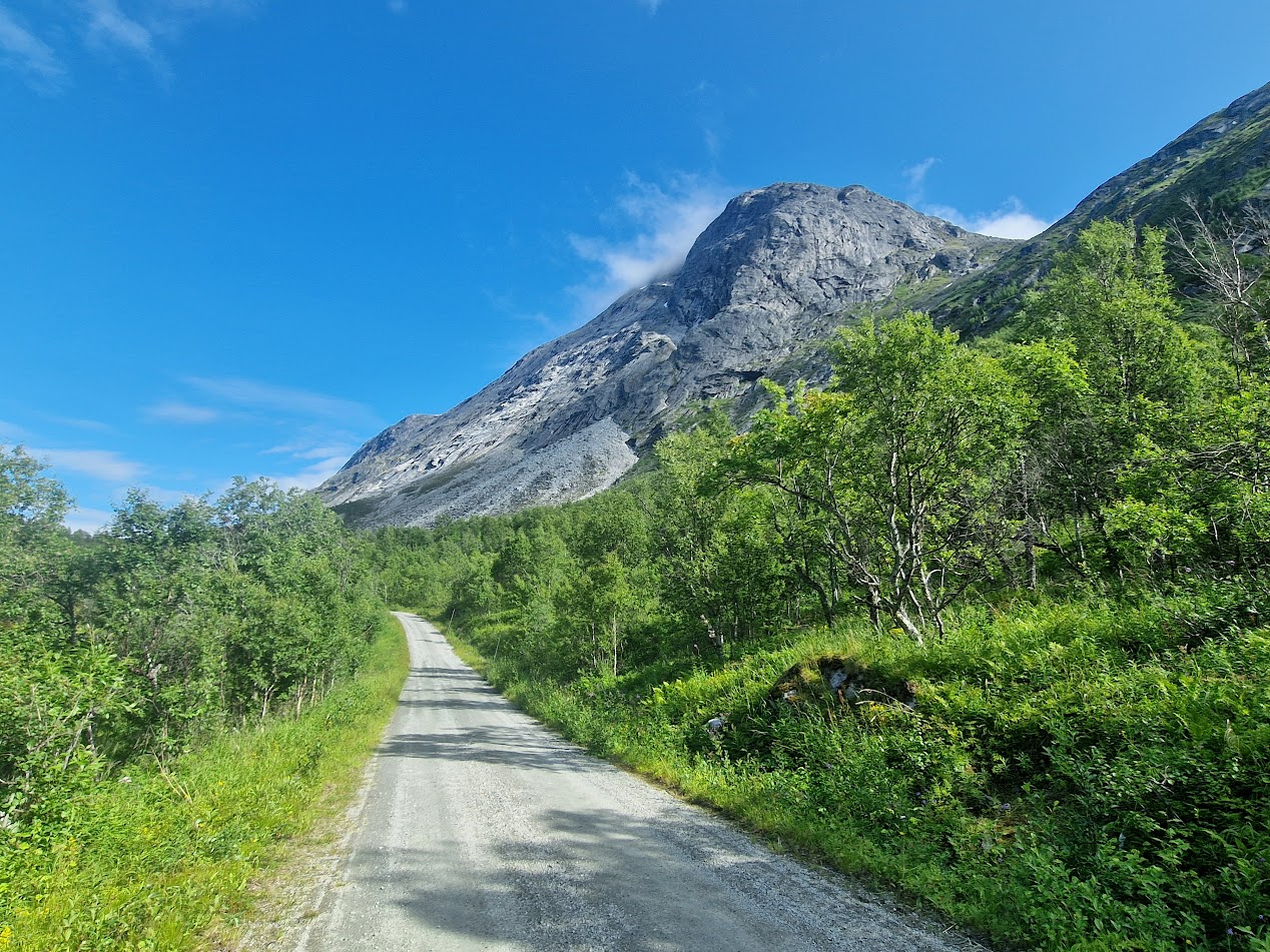
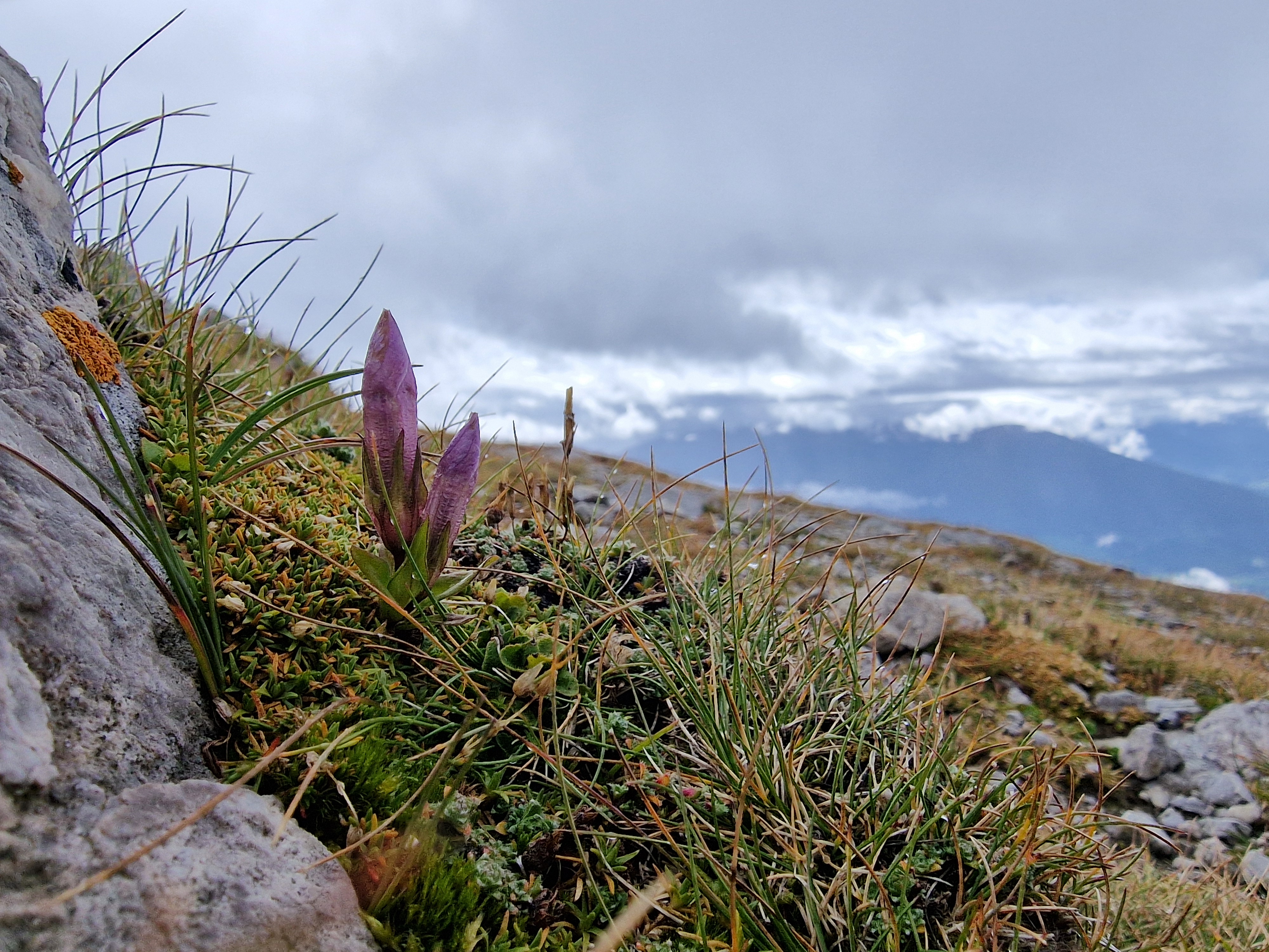
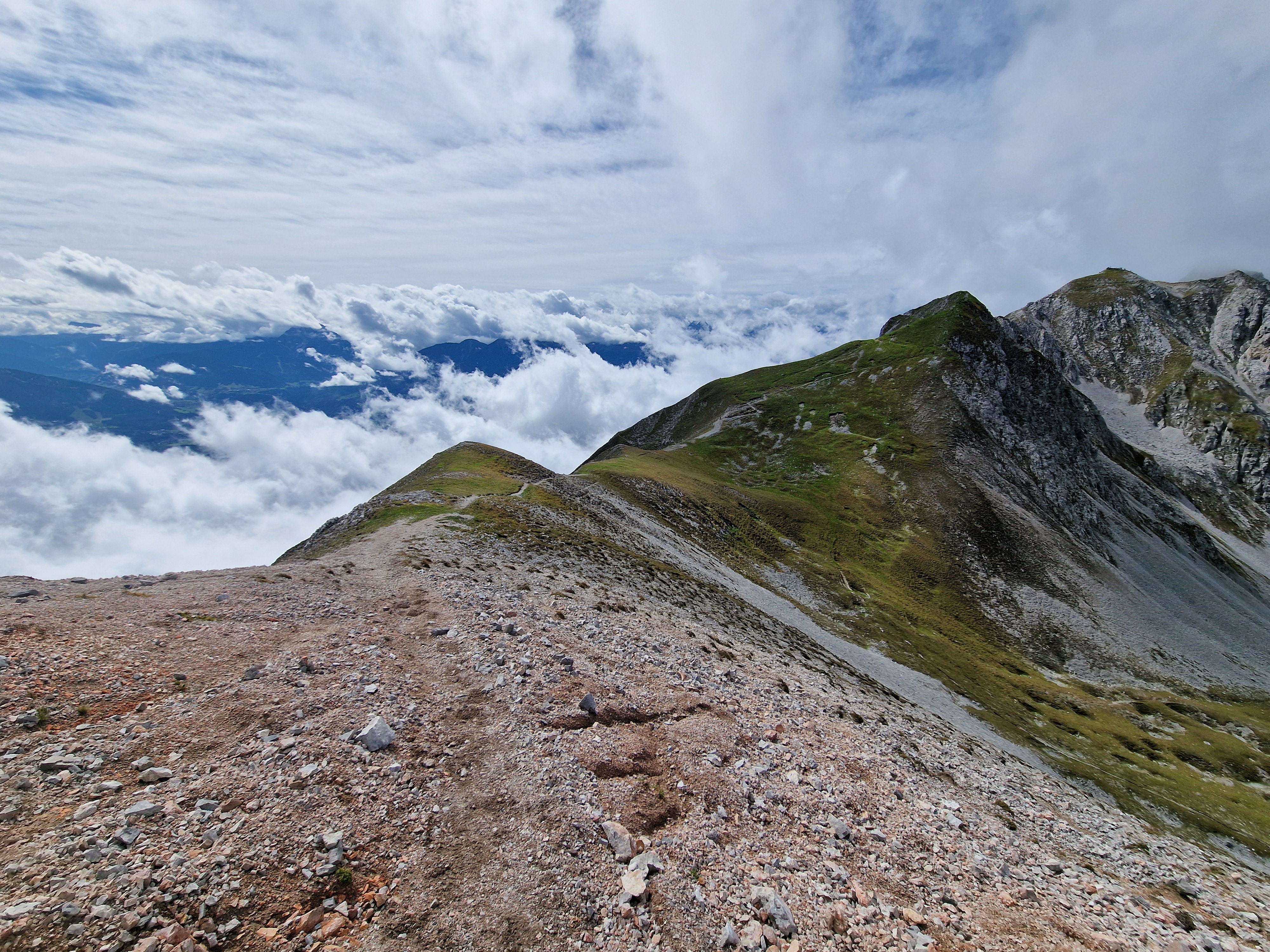
Austrian Alps close to Innsbruck

Waiting for the long game

Detecting a slow-moving process like vegetation change requires one thing science is often failing at nowadays: patience. You need standardized data, collected the same way, in the same places, for a long time, before subtle trends become statistically visible above all the noise of local weather patterns, disturbance and plain old stochasticity.

We got there now, finally. One of the best examples of such datasets out there is GLORIA-Europe, arguably the largest coordinated monitoring network for climate-change effects, focussing on mountain summit vegetation. Since 2001, GLORIA teams have been resurveying permanent vegetation plots on summits right across Europe (and far beyond, but let’s stick to Europe for this story). In this study we used four such surveys, spanning 21 years, across 724 permanent plots on 53 summits in 14 mountain regions, from the Pyrenees to the Carpathians. On top of the vegetation data, many of these summits also carry soil temperature loggers, giving us a second, independent, on-the-ground record of how conditions have actually changed where the plants are actually growingm not just what a weather station kilometres away says. And don’t we all know how crucial I think that is!

Chasing the warmth-lovers

With that data in hand, the question we wanted to answer was as simple as it was genius: are these summit plant communities becoming dominated by more warmth-loving species – a process called thermophilization – and if so, does that track the pace of warming? It’s the kind of question that feels almost too obvious to need testing, right? Warmer summit, more room for species that like it warm. Case closed?

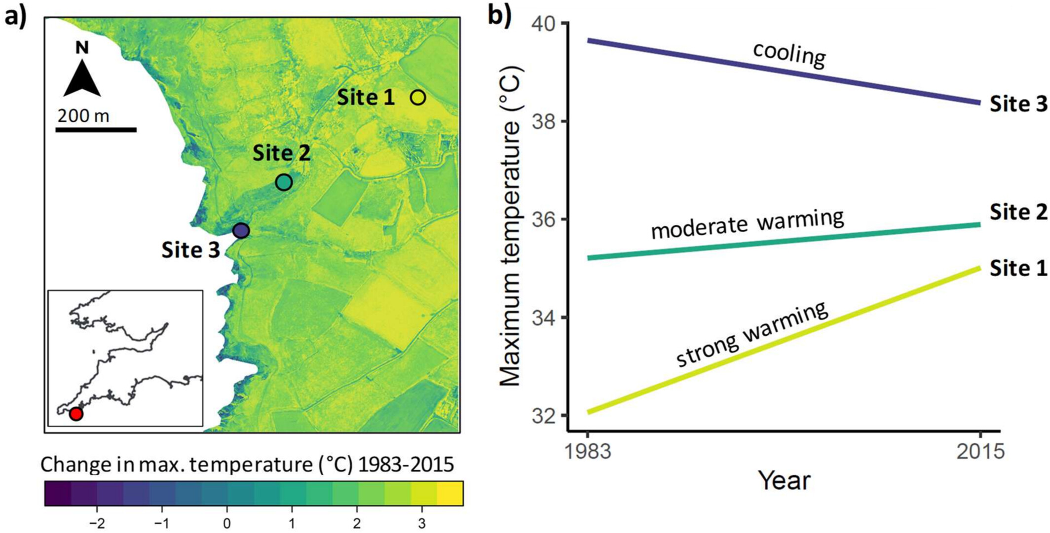
Strong, significant warming trend in both micro- (left) and macroclimate on and around European mountain tops

Ok, yes, thermophilization is happening, clearly and widely. Averaged across all 724 plots, the composition of summit communities has been shifting steadily towards warmth-associated species for two decades, a signal so consistent that nearly two-thirds of individual plots show the trend individually. It’s a slow process, but it is unmistakably there. And yes, both the interpolated macroclimate and the on-site soil microclimate warmed too, across almost every temperature metric we looked at. Cool findings on its own: climate change is happening, and species are responding to it. Louder now for the people in the back!

On average, summit vegetation is showing signs of warming (63% of plots show thermophilisation)

Ah, but did we now forget about the but I mentioned! That but is there in how loosely those two very real trends are actually coupled. At the level of an individual plot, the relationship between the pace of local warming and the pace of thermophilization was surprisingly weak. A single temperature metric, measured over the monitoring period, barely explained any of the variation in how fast a plots’ vegetation was showing signs of warming. Things improved a bit once we allowed vegetation to lag a few years behind temperature (four years turned out to be the sweet spot) and once we combined several temperature metrics instead of relying on just one. But even our best-performing models explained less than 10% of the plot-to-plot variation in thermophilization. Somewhat to our surprise, this held even more strongly for the on-site microclimate data than for the macroclimate – exactly the opposite of what we expected going in, given how often microclimate turns out to be the better predictor in this kind of work.

It’s not (just) the climate, it’s the neighbourhood

If temperature alone can’t explain why some plots thermophilize fast and others barely move, what does? This is where the story gets its real weight. We added two simple pieces of local context to the models: 1) how many warmth-loving species were already growing just below the top, ready to move in, and how much of the top was bare rock and scree rather than colonizable ground. Including these parameters helped the explanatory power jump substantially, to an average of 37% . And warming and colonizer availability interacted: where warmth-loving neighbours were close at hand, rising temperatures translated into thermophilization much more readily than where they weren’t.

In hindsight, that makes a lot of ecological sense. A plant community can only respond to warming with the species that are actually available to respond with. No matter how fast a summit warms, if there’s no thermophilic species sitting just downslope ready to move up, and no open substrate for it to land on, that summit simply cannot thermophilize quickly – climate change or not. Dispersal and substrate act as a kind of gatekeeper on the door that temperature is trying to open.

Thermophilisation rate interacts with the availability of thermophilic colonisers (low vs. high on the x-axis) just below the summit

What this means

None of this undermines the reality of climate-driven vegetation change on Europe’s summits, of course! The thermophilization signal is real, and it lines up with a genuine warming trend. But it’s a strong reminder that even the most simple stories in ecology hold complex and important nuances in them. The abiotic and biotic context a community sits in – its neighbours, its substrate, its dispersal opportunities – shapes how, whether, and how fast that response actually plays out. If we want to forecast how mountain biodiversity will look in fifty years, temperature trends alone won’t get us there; we’ll need to understand colonization dynamics and landscape context just as well.

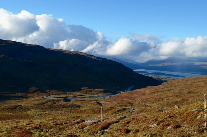
Swedish Alps close to Davos

It also makes a strong case for keeping – and intensifying – long-term, standardized monitoring efforts like GLORIA. It took two decades of consistent data collection across an entire continent to even be able to ask this question properly, let alone answer it with any nuance. That’s a lot of ecologists and botanists standing on a whole lot of mountain tops over the year! Let’s make sure that we can all keep doing that.

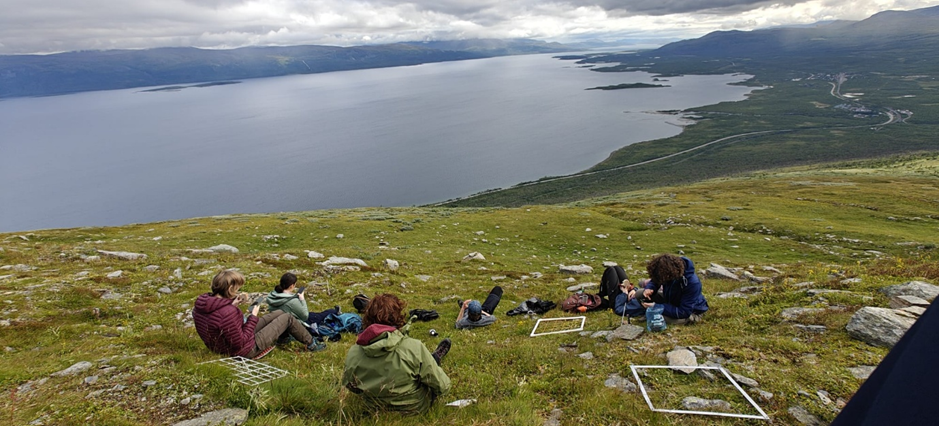
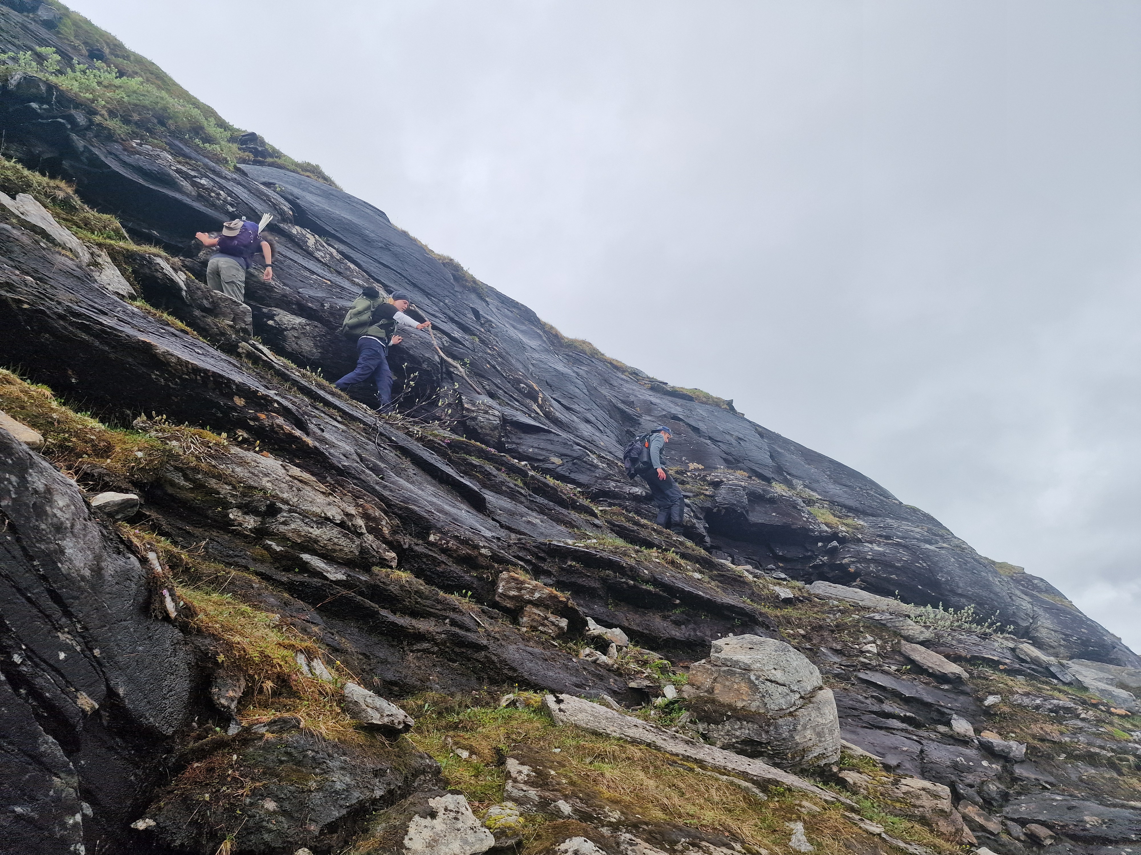
Student taking a high-resolution GPS-coordinate of a snowbed plot surveyed for the first time back in the 1950s, in northern Sweden. Exactly the kind of science we should keep making possible

Reference: Hausharter et al. (2026). Widespread thermophilization but weak link to climate warming in Europe’s summit plant communities. Nature Ecology & Evolution. https://doi.org/10.1038/s41559-026-03150-x

Posted in Science | Tagged , , , , , , , | Leave a comment

MEB 2026

Big week in Montpellier this week, as the world’s microclimate ecology and biogeography community has gathered for the third global MEB conference.

After the first edition in Antwerp in 2022 and the second in Helsinki in 2024, this year’s conference is bigger and more diverse than ever.

Just one day in, I already feel like our field has truly grown beyond its original boundaries (symbolized, perhaps, by this brave little vine from the first day’s excursion). Microclimate has permeated nearly every corner of ecology and biogeography, and its importance for improving our understanding of ecological patterns and processes is high on everyone’s agenda.

That doesn’t mean the work is done – far from it. We also recognize that the world of microclimate is remarkably heterogeneous (something beautifully reflected in the landscape of the Cirque de Navacelles, visited during yesterday’s excursion).

In many ways, by incorporating microclimate into our research, we’ve added an entirely new dimension to ecology. The challenge now is figuring out how to embrace that complexity without becoming overwhelmed by it.

Fortunately, with a room full of bright and enthusiastic minds, we’re well equipped to keep moving the field forward.

Posted in General | Leave a comment

A beautiful birthday

The MIREN network has turned twenty! Imagine: a global ecological network, built on friendship, enthusiasm, and a shared love for mountains, that has managed not only to survive, but to grow and thrive for two decades. In a scientific world often shaped by short funding cycles and shifting priorities, that is no small achievement.

And this truly is a year of celebration for the network. At the end of last year, we gathered in Innsbruck, Austria, for a workshop that looked both backward and forward: reflecting on where MIREN came from, while laying the foundations for where it is heading next. We also officially kicked off preparations for a new coordinated round of global mountain roadside monitoring in 2027. And now, to top it all off, a celebratory paper has just been published in Biological Invasions.

The paper tells the story of twenty years of MIREN: what the network has achieved, how it managed to sustain itself over such a long period, and what other global research collaborations might learn from it.

MIREN was founded in 2005 through the vision and leadership of Peter Edwards and Hansjörg Dietz in Switzerland, together with Catherine Parks and Richard Mack in the United States. They invited a group of ecologists to a foundational workshop on the outskirts of Vienna, where MIREN’s central aim first took shape: understanding and addressing the growing risks posed by biological invasions in mountain ecosystems.

Since then, the network has steadily expanded. Our core and longest-running initiative, the MIREN road survey, now includes data from 27 mountain regions across the globe, with 30 regions already planning to participate in the upcoming 2027 resurvey.

Map of the 27 contributing mountain regions to the MIREN road survey
Cumulative number of sites contributing to the MIREN road survey

One of MIREN’s greatest strengths, at least to me, is its decentralized structure. Every region has its own ecological story to tell – and many collaborators do exactly that through regional studies and local publications. But together, these regions also allow us to answer the much larger questions that no single mountain system could address on its own. That balance between local ownership and global collaboration is rare, and incredibly powerful.

MIREN is also unusually balanced in terms of global representation. In our core road survey, nearly half of the contributing regions (48%) are based in the Global South, and the steering committee is similarly distributed across continents. Of course, important gaps remain: tropical mountains and large parts of Africa – apart from South Africa – are still underrepresented. But compared to many international ecological networks, MIREN has managed to build something remarkably global.

That global nature does come with practical consequences, of course. Steering committee meetings regularly happen either before anyone’s first reasonable cup of coffee or well past midnight. Yet those sleepy faces keep showing up, year after year. And I think that says the most about the affection people feel for this network.

MIREN meeting in Innsbruck last year and doing what we did best: scale the mountains

One of the key questions we discussed during our recent meeting in Innsbruck was how to remain relevant in a rapidly changing world – scientifically, socially, and in terms of conservation priorities. We certainly do not have a definitive answer. But a few important ingredients became very clear.

One is maintaining a healthy balance between long-standing and new members. New voices bring fresh ideas, energy, and perspectives. At the same time, the continuity provided by members who have been involved for years helps preserve the values and practices that allowed the network to flourish in the first place.

Another crucial element is the importance of meeting in person. Those moments together allow us to periodically rethink our objectives, create space for new conceptual directions, and recalibrate priorities – while still keeping MIREN’s core mission at the center: standardized, long-term ecological monitoring.

And perhaps most reassuring of all was the level of enthusiasm in Innsbruck. Many regions are stepping up their efforts, launching exciting new local and global research projects, and expanding collaborations. Beyond the original road survey, we have also made major progress with MIREN Trails and MIREN Rocks, elevating both initiatives to the same level of standardized monitoring as our “classic” roadside surveys.

Trends in the main keywords in the 99 MIREN papers over time

Twenty years of MIREN have resulted in a remarkable scientific legacy: ninety-nine papers so far – with this latest one becoming number one hundred.

So yes – there is truly a lot to celebrate.

And the nice thing is: the story is far from finished. You can still become part of it yourself. Join the MIREN road survey in 2027, participate in the MIREN trail survey in 2028, or contribute to MIREN Rocks whenever you feel like it.

Because after twenty years, the mountains are still full of stories waiting to be told.

Reference: Pauchard et al. (2026) Collaborating across mountains: contributions of the Mountain Invasion Research Network (MIREN) to ecology and conservation. Biological Invasions

Posted in General | Tagged , , , , , | Leave a comment

500 species

Last week, I spent a few days just outside of Barcelona for a PhD defence. Perfect timing, I thought, to finally cross the magical boundary of 500 unique species on iNaturalist. I had been hovering just below it for a while, and to me, that number always felt like the line between a casual observer and a slightly more committed enthusiast.

The magic boundary of 500 species on iNaturalist so easily crossed

Now, oh boy, was that easy.

Just a small walk – about an hour – from the train station to the campus, and the boundary was crossed, and then some: 45 new species added to my list. Of course, finding new species is always easier when visiting a new place. But there was something else going on too. The landscape was just that little bit… messy.

Agriculture, but messy – a landscape with room for a lot of biodiversity hidden in the verges, forest edges, shrubberies and the fields themselves.

A kind of messiness that has become unfortunately rare in the Netherlands, yet is so important for biodiversity.

It was farmland, but farmland filled with corners, slopes, edges, shrubs, trees, and tiny neglected patches where wildflowers could persist. The borders between “field” and “nature” were blurry. And those blurry borders were full of life.

That kind of landscape heterogeneity is harder to find in the Netherlands nowadays. Partly because we simply lack the topographic variation of places like Barcelona, where a gradient from a dry hilltop to a wet valley can create many different habitats within a short distance. But also because our landscapes have become increasingly optimized and tidy over time. Fields are cleaner, straighter, and more intensively managed. The small irregularities that once created space for biodiversity have often disappeared.

In the fields outside of Barcelona, it was often unclear where the field ended and the border begun, and plants loved that vagueness!

And when bits of semi-natural vegetation do remain, they are frequently affected by excess nitrogen deposition. Many of these places become dominated by a few highly competitive species – brambles, nettles, coarse grasses – leaving less room for the wide variety of plants that once characterized them.

Walking there made me realize how much I miss that ecological messiness in the Netherlands. Because these messy landscapes create opportunities for iNaturalist enthusiasts trying to reach arbitrary milestones, of course, but more importantly: because they create opportunity for plants, insects, birds and nature to thrive.

Until then, I suppose I’ll keep boosting my species list elsewhere.

Posted in General | Tagged , , , , | 1 Comment