What mountain roads do to root-associated fungi

Some papers just hit harder than others. And this latest one – just out in Molecular Ecology – sits right at the top of the epic scale. The topic? The impact of mountain roads on plant-fungal interactions.

Here’s the thing: we’ve been looking at the effects of mountain roads for years – since 2007, in fact, when the first surveys of the Mountain Invasion Research Network (MIREN) kicked off. And over time, we learned a lot: changes in plant communities, upslope and downslope shifts in distributions, effects on functional traits – you name it. But one thing remained a mystery: what was going on belowground.

So, we decided to go digging. Literally.

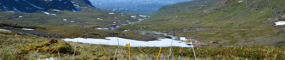
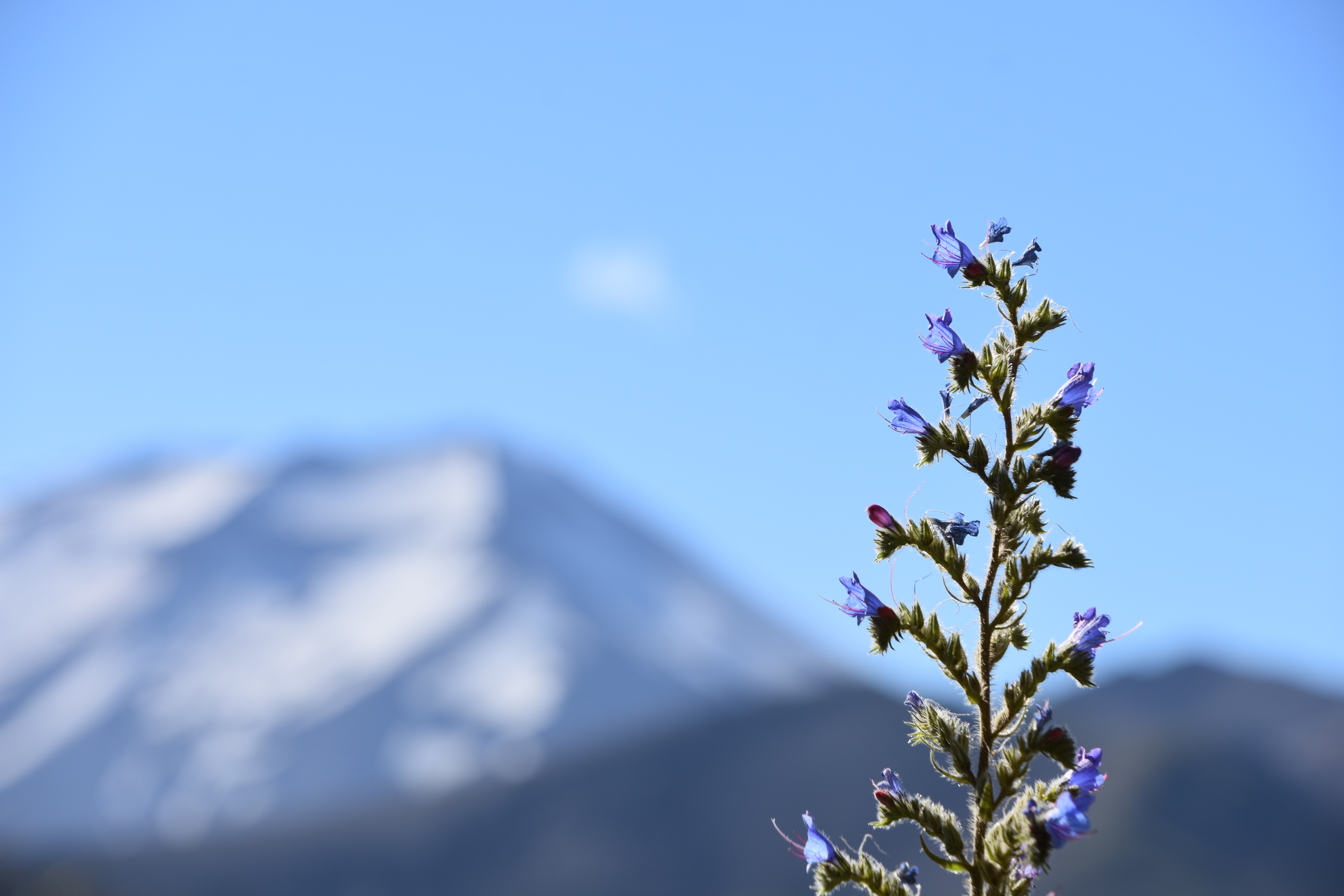
We set out with an ambitious plan: sample roots from long-term MIREN plots – both roadsides and adjacent vegetation, across elevation gradients and multiple regions. The goal? To understand how root-associated fungi respond to road disturbance, and whether these patterns shift with altitude or across continents.

A Norwegian forest understory of Cornus suecica and Vaccinium vitis-idaea, one of the vegetation types of interest in our study.

Solid idea, right? But then came the execution.

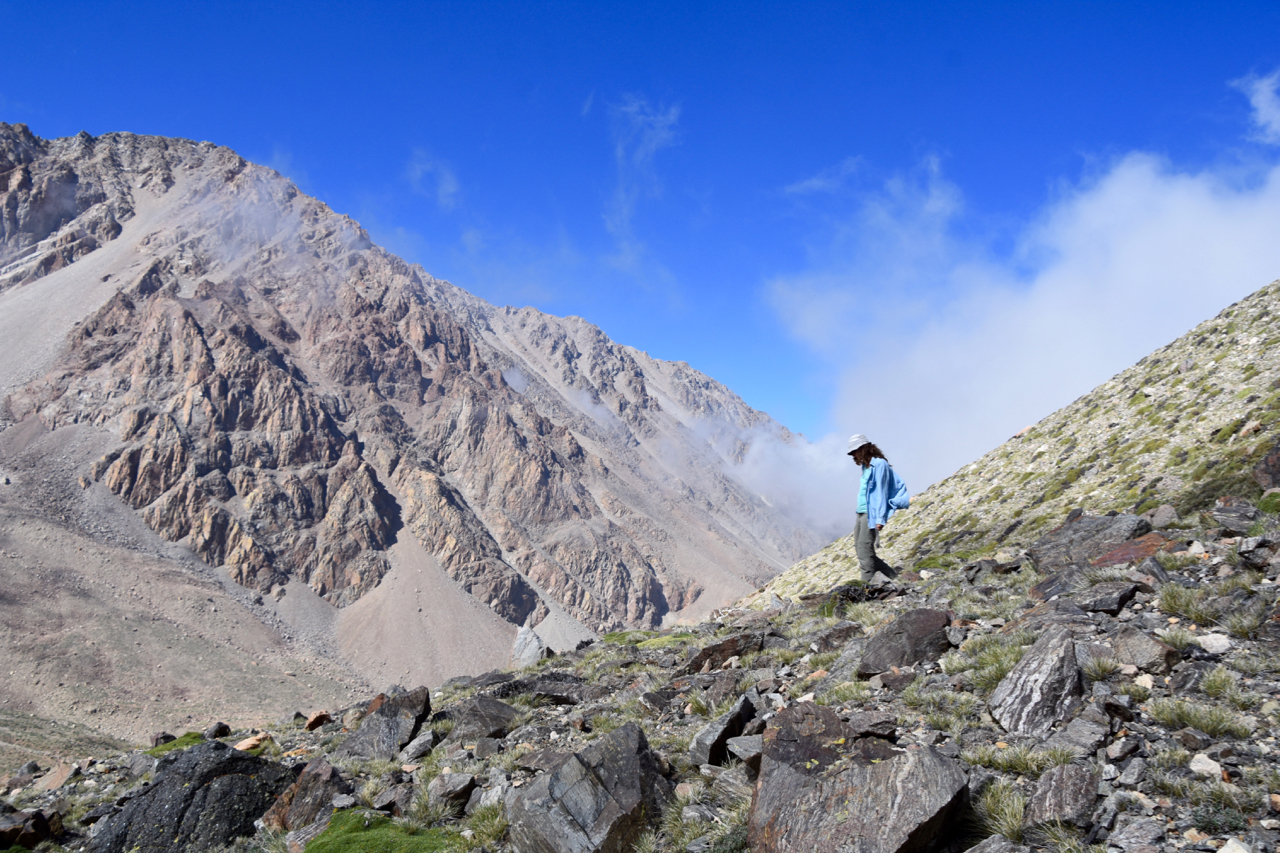
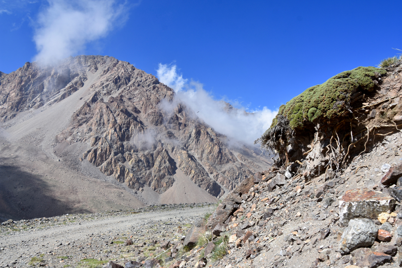
Enter the epic field trips: Norway, Chile, Argentina. Samples flown in from Tenerife and the Czech Republic. Sorting root samples. Washing them. Cutting them into tiny pieces. Amplicon sequencing to reveal the fungal communities hiding inside. Add in a freezer disaster that cost us an entire region’s worth of samples (yep, that happened!), and then the analytical rabbit hole: plant species, fungal species, interactions, co-occurrence patterns… A deep dive into Joint Species Distribution Modelling to figure out what we can and cannot tease apart from this complex mess.

Scouting for plants in the Andes

Honestly? Easily the most time-consuming paper I’ve worked on so far. And that doesn’t even count the countless hours of meticulous, patient work by first author Dajana – without her expertise in soil microbial ecology, this paper simply wouldn’t exist.

But oh boy, was it worth it.

For the first time, we can now see the belowground implications of these heavily studied mountain roads. And the impact? Brutal. Roadside plots consistently showed a collapse in the complexity of plant-fungal and fungal-fungal co-occurrence networks – by 66–95% and 40–94% in total edge density, respectively. And yet, interestingly, fungal richness didn’t go down. Many of the key taxa were still present.

What this tells us is that the species are still there – just like aboveground, where we often see even more plant species in roadsides than in adjacent plots. But their networks are gone. Their roles, their interactions – the whole belowground social fabric – has unraveled. They’re in the roots, but they’re not doing what they’re supposed to be doing.

Example plot visualizing the loss of interactions in Chile. Each blue dot is a negative link between two species, each red dot a positive link. The left side shows the situation in the adjacent vegetation, where two groups of co-occurring species are clearly identified. The right side is the situation in the roadside, where that whole interaction network is disrupted and only some scattered points remain.

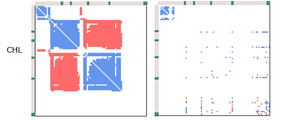
And in that ecological vacuum, the usual suspects step in: generalists like arbuscular mycorrhizae, who aren’t very picky about their plant partners, and pathogens with low host fidelity. They thrive. But more host-specific fungi – like ectomycorrhizae – don’t. Just like we saw in several of Jan Clavel’s PhD papers (e.g., here), those specialists don’t fare well in these unpredictable, human-altered environments.

Echium vulgare, one of the many European non-native species in Chilean roadsides. New species bring new belowground interactions, and networks that are often substantially less mature.

Our takeaway? Road disturbance leaves a consistent negative imprint on the connectivity between plants and fungi. It’s a stark reminder that even systems with high species richness can be fundamentally unstable and vulnerable – especially when facing additional pressures like climate change and biological invasions.

Road disturbance in action high in the dry Andes west of Mendoza, Argentina

So yes – please take the time to dive into this paper. We poured our hearts into it.

Reference: Radujkovic et al. (2025). Road Disturbance Shifts Root Fungal Symbiont Types and Reduces the Connectivity of Plant-Fungal Co-Occurrence Networks in Mountains. Molecular Ecology. https://doi.org/10.1111/mec.17771

Posted in Science | Tagged , , , , | Leave a comment

The Tea Bag Index: simple on the surface, complex beneath

Oftentimes the simplest scientific methods hide a whole iceberg of complexity. The Tea Bag Index (TBI) is no exception. On the face of it, it’s brilliantly straightforward: bury some green and rooibos Lipton tea bags, dig them up after about 90 days, and compare how much they’ve decomposed. What could be easier?

Well… as always in science, a lot, actually.

Our recent paper in Ecology Letters, based on a whopping 36,000 tea bags, sparked some healthy scientific debate. In a follow-up response to critiques by Mori (2025), we now dove deeper into the assumptions behind the TBI and clarified what this method can and cannot tell us.

At its core, the TBI is designed to give everyone – from scientists to students and citizen scientists – an accessible way to study decomposition across environments. It does this by estimating two key values:

  • S_TBI: how much material resists decomposition (a stabilisation factor)
  • k_TBI: how quickly decomposition starts (an initial rate)

The method’s strength lies in its simplicity and global standardisation. It allows us to compare results across locations and climates without the messy variation of local litter types. That makes it incredibly useful for large-scale studies. But because it’s such a simplification of the real world, it’s important to use it with care.

What the TBI tells us – and what it doesn’t

Plant material, including tea, breaks down in stages. Some parts go fast, others hang around for years. The TBI focuses on the early, fast stage, but in the real world, the slow stuff might start decomposing earlier than assumed. So, while the TBI gives us a valuable snapshot of early decomposition, it doesn’t reflect the full timeline of what happens to organic matter in soil.

Simplified TBI-model (left and middle) versus a more realistic decomposition model (right).

Rethinking the assumptions

The TBI assumes that 90 days is enough for green tea to reach a stabilised phase (so you can measure S_TBI) and that rooibos tea is still in its early phase (so you can measure k_TBI). Our data confirm that green tea generally fits this assumption well. Rooibos tea, however, shows more variation – and that variation isn’t always easy to explain.

Another assumption is that we can use green tea’s stabilisation factor to estimate that of rooibos tea. But our findings show that the predicted stabilisation (S_TBI) doesn’t always match what’s actually observed in long-term rooibos data. In fact, applying S_TBI early on might inflate k_TBI. However, since k_TBI tends to underestimate actual decomposition rates (k_real), this may not be a major issue.

So, what can we trust?

Despite its imperfections, the Tea Bag Index remains a valuable tool. It captures short-term decomposition well and enables comparisons across environments by using a consistent material. It’s not meant to replace more detailed, site-specific studies – it’s meant to complement them.

For future work, we suggest treating the two TBI parameters – k and S – as distinct components shaped by different environmental drivers. Combining TBI results with chemical analyses and longer-term studies could help bridge the gap between simplicity and ecological realism.

In the end, the Tea Bag Index doesn’t capture the whole story of decomposition – but it does capture a really useful chapter. And sometimes, that’s exactly what you need.

Posted in General, Science | Tagged , , | Leave a comment

The graph that surprises nobody

Our recent paper in Nature summarizing the work of the Dark Diversity Network contains a simple – and for that reason rather horrifying – graph. It’s not much more than a linear regression, a line through some points:

It summarizes the relationship between the Human Footprint Index – a measure of the human modificiation of the landscape at a coarse scale – and the percentage of suitable plant species in our Dark Diversity plots.

That percentage is something unique: the network’s elaborate monitoring design was set up in such a way that we could estimate the total potential species pool of an area. The graph shows the percentage of that total species pool that was actually present at the site.

Now, what surprises nobody: the graph shows a steep decline – from around 35 to 20 % – in that percentage between sites without a human footprint up till an index of eighteen. Humans remove species from the land – clear and simple. What makes this analysis unique is that we find this after correcting for the potential of a certain area, and thus only look at the loss in potential, not the total loss of species. That correction is necessary to unearth these strong patterns, otherwise they get lost in the high variability in species diversity worldwide.

Now, the shape of the graph: a strong decline in realized diversity potential with increasing human footprint – is likely not a surprise to anyone. Nevertheless, it’s a story that needs repeating: it is the direct imprint of humans on a landscape that kills its diversity and it is that human footprint that we’ll have to keep fighting if we want to turn the tide for global biodiversity.

Now, how to win that fight in our multifunctional landscapes where biodiversity rarely plays the first violin, that’s a different story. But I am here to keep fighting that fight!

Find the paper here: https://www.nature.com/articles/s41586-025-08814-5

Posted in General | Tagged , , , , | 1 Comment

Global impoverishment of natural vegetation revealed by ‘dark diversity’

Back in 2019, we ventured into the field with a rather unusual mission: to search for the biodiversity that wasn’t there. At first glance, this might seem counterintuitive – after all, we’re accustomed to documenting what exists. Yet, by exploring what is absent, we uncover a narrative of loss and missed ecological opportunities.

The idea of measuring missing biodiversity originated in Estonia and is termed “dark diversity.” This concept doesn’t refer to the simple absence of all species – like the glaring lack of palm trees in a Flemish heathland – but rather to those species that could theoretically flourish in an environment, yet remain missing. In essence, dark diversity represents the shadow of potential life that hints at both historical losses and unrealized natural potential.

Dark clouds over our dark diversity field site in a Flemish heathland. This particular plot was undergoing active restoration – future work will show us how much of the dark diversity would have returned.

To delve deeper into this phenomenon, the Dark Diversity Network set out on a global journey. Using a unique survey design and specifically developed statistical methods, the network aimed to distinguish between species that should be present and those that are not. The culmination of this effort was the publication of a first large-scale paper in Nature, whose findings are as unsettling as they are revealing.

Now, drawing on data from over 200 scientists, the network spans nearly 5,500 sites across 119 regions worldwide. This extensive collaboration exposed the hidden toll of human activities on natural vegetation. In ecosystems with minimal human interference, more than one-third of the potentially suitable species are present, with the remainder missing largely due to natural constraints like limited dispersal. By contrast, in areas heavily impacted by human activity, only one in five suitable species is found.

Area in northern Norway in which dark diversity is still low, thanks to the low human footprint.

Traditional biodiversity assessments – often based solely on the number of species recorded – failed to capture this nuanced decline. Such methods obscure the true impact of human disturbance by not accounting for the inherent potential of a given ecosystem. Instead, the study’s approach, which integrates the concept of dark diversity, reveals a far more comprehensive picture of ecosystem health.

Central to this research was the use of the Human Footprint Index, a composite metric that evaluates human population density, land-use changes (including urban development and agriculture), and infrastructure elements like roads and railways. The study demonstrated that as the Human Footprint Index increases, plant diversity diminishes—not only within the immediate vicinity but also across surrounding regions, sometimes extending hundreds of kilometres away.

Distribution of research sites in the DarkDivNet, and the relationship of the realized biodiversity potential as a function of the Human Footprint Index.

These findings are alarming, as they reveal that human disturbances extend well beyond urban centers -even infiltrating protected nature reserves. Pollution, logging, littering, trampling, and human-induced fires can drive plants from their native habitats and hinder natural recolonization. Notably, the adverse effects of human activity were less severe when at least one-third of the surrounding landscape remained pristine – a threshold that reinforces the global objective to safeguard 30% of our land.

This study underscores the importance of nurturing ecosystem health at a landscape level, not just within the confines of nature reserves. It’s clear that large-scale environmental dynamics significantly shape local biodiversity. This fits in neatly with the MicroFracNet we recently launched, an initiative dedicated to exploring biodiversity patterns across scales and deciphering how various drivers determine species presence or absence. We warmly welcome anyone interested in joining this exciting project!

Conceptual approach summarizing the calculation of the dark diversity species pool

Reference: Partel et al. (2025). Global impoverishment of natural vegetation revealed by dark diversity. Nature. https://www.nature.com/articles/s41586-025-08814-5.

Posted in Science | Tagged , , , , , , , , , | Leave a comment

Non-native plants in the worlds’ cities

Non-native species have been widely studied for decades, and their affinity with urban environments is no surprise to anyone in the field. However, just how many non-native species dwell in our cities was so far unknown. With a global consortium of invasion ecologists, we set out to map this invasion in cities around the world – starting with a simple count of non-native species. The results are as impressive as they are concerning.

Our approach was straightforward enough: count the number of non-native plant species in various cities. By examining 61 countries, we obtained a clear snapshot of the impact non-native flora is having on urban environments. The full tally: 8140 species from 553 urban centres across the globe!

Numbers were particularly high in cities across the United States and Australia, while in Europe, London led the count. In the Netherlands – my new scientific home – we identified no fewer than 860 non-native species, ranking our country 15th among the 61 nations examined. However, it’s important to note that these figures reflect both the extent of invasion and variations in sampling intensity, so they should be interpreted with caution.

No surprises in the number of non-native plant species per family, with the Asteraceae, Poaceae and Fabaceae as so often leading the ranks

What is particularly interesting, however, is which species are leading the dance. The usual suspects, of course, with the overall record holder being the Canadian finebeam (Erigeron canadensis), a scrawny little thing of no apparent beauty that was found as a non-native in a mindboggling 469 cities across 47 countries. Its ability to thrive in diverse climates and urban settings is both fascinating and concerning.

The Canadian finebeam showing its best side at my back door. Interesting to realize it’s growing as a non-native speices between tiles of at least 469 cities worldwide!

Number 2? Veronica persica, still found in 41 countries. Exactly the reason why we studied its performance in urban settings in a previous paper!

The innocent-looking blue flower of Veronica persica in our pot experiment.

What do these numbers mean for our cities? They provide valuable insights for urban policy while raising pressing questions about the resilience of our ecosystems. How will we manage the growing presence of non-native species, and what can we learn from the Canadian finebeam’s success?

Our new database paves the way for future studies and policy discussions. By mapping non-native plant invasions, it offers key data and tools for comparative assessments, hypothesis testing (like biotic resistance or invasion debt), and even modeling invasion dynamics. Ultimately, this resource supports informed decision-making in conservation, ecosystem restoration, and sustainable urban management.

Reference: Li et al. (2025) GUBIC: The global urban biological invasions compendium for plants. Ecological Solutions and Evidence. https://besjournals.onlinelibrary.wiley.com/doi/full/10.1002/2688-8319.70020

Posted in Science | Tagged , , , , , , , , , | Leave a comment

MicroFracNet

An add-on to the global EcoFracNet monitoring protocol

Call to action: Monitor plant biodiversity and microclimate using a standardized design across scales from 0,5 m to 900 m to help us assess the scales at which biodiversity varies, and at which scale it matters for ecosystem functioning.

Main contact person:
Jonas Lembrechts,
Utrecht University, the Netherlands.
j.j.lembrechts@uu.nl 

Join the network by filling out the 30 second sign-up form here!

The Ecological Fractal Network (EcoFracNet) explores how ecological patterns and processes scale across space and time using a standardized fractal design with nested plots. While the original design spans plot distances from 100 to 900 m, many landscapes – especially fragmented ones in multifunctional landscapes – demand a closer look. Small-scale ecological complexity is equally critical in topographically diverse regions like mountains or Arctic tundra, where fine features such as hummocks and hollows shape biodiversity (Fig. 1).

To address these needs, we developed the MicroFracNet add-on, which enhances EcoFracNet by zooming in on fine-scale heterogeneity. By adding plots at 11 and 33 m within the original 100-meter units, MicroFracNet captures trends often overlooked at larger scales (Fig. 2). This approach incorporates the observations made in the EcoFracNet about the complexity of many landscapes, and expands the focus beyond large natural patches to fragmented habitats and unconventional havens for biodiversity, such as gardens, schoolyards, urban spaces, and farmland—ensuring no biodiversity is left behind.

Each plot remains a 1×1 m vegetation survey area, subdivided into four quadrants for detailed data collection. Wherever possible, link biodiversity patterns to microclimate variability by installing sensors (e.g., TOMST TMS4, Fig. 3) in key plots (see ‘microclimate protocol’ on the EcoFracNet-website). This high-resolution monitoring can further be integrated seamlessly with other EcoFracNet protocols like the bird and butterfly surveys already on the website. We also aim to incorporate additional measures such as decomposition (tea bags) and soil nutrient analysis, for which protocols will be added to the website later.

Figure 1: The scale of heterogeneity in a landscape varies widely and plays a crucial role in shaping ecological patterns and processes. In topographically complex regions like northern Norway (left), fine-scale features such as slopes, ridges, and valleys influence biodiversity. In agricultural landscapes (center), monocultures dominate, often creating large-scale homogeneity with little structural variation, as seen here on a misty morning in the Netherlands. In such landscapes, however, fine-scale fragmented patches of nature might still play crucial roles. In contrast, urban environments (right), exemplified here by Maastricht, Netherlands, exhibit extreme small-scale variability due to the diverse land uses and structural complexity of the built environment. 

We are already piloting MicroFracNet at multiple sites across the Netherlands, developing a high-resolution case study to explore local biodiversity and ecosystem dynamics. We now however welcome both Dutch as well as international collaborators to join, as expanding the network globally will enable cross-regional comparisons of heterogeneity and enhance our understanding of how ecological patterns scale across diverse landscapes.

You can find a detailed version of the plot design here. For further guidance on setting up your study sites, identifying plot locations using GIS, conducting vegetation and microclimate monitoring, data sheets for data submission and exploring potential add-ons, refer to the original EcoFracNet protocols (Ecological Fractal Network – Protocol).

Join the network by filling out the 30 second sign-up form here!

By joining the network you will:

  1. Have the opportunity to be part of at least one joint paper on the spatial scale of heterogeneity and its implications for biodiversity (Fig. 4).
  2. Join an international community using a shared data standard to understand spatial scaling.
  3. Automatically have your data be eligible for inclusion in the wider EcoFracNet database.

Figure 2: MicroFracNet study design. The study design builds on the standard EcoFracNet framework by incorporating additional plots within the core bottom triangle (open circles), spaced at distances of 33 and 11 m from each other. Each plot consists of a 1×1 m vegetation survey area, consistent with the standard EcoFracNet methodology, and is further divided into four quadrants for detailed analysis (see inset, bottom right). Plots in red should – as much as possible – be prioritized. However, in areas of 500 x 500 m or less, one could also limit themselves to the bottom triangle only. Note that the orientation of the triangle can be adapted to local conditions.

Figure 3: if possible, augment the plant biodiversity monitoring with microclimate sensors (here a TOMST TMS4), to help us quantify heterogeneity in environmental conditions that underlie heterogeneity in biodiversity. 

Figure 4: Preliminary findings reveal high community dissimilarity even at the smallest spatial scales within a 0.4 ha nature reserve at Utrecht Science Park, the Netherlands. The red line highlights the increased dissimilarity driven by fine-scale variation in management practices, specifically differences in mowing regimes.

Posted in Science | Tagged , , | Leave a comment