Where are they NOT?

We ecologists and biogeographers all want to know so badly where species are and are not living. This quest lies at the very heart of our discipline, as it provides invaluable insights into how global changes are impacting biodiversity across the planet. For this quest, we are relying on a vast array of models collectively known as ‘Habitat Suitability Models’ (HSM), which serve as our guiding compass in predicting exactly that.

Now, while there are countless ways to improve (or screw up) those models, their efficacy ultimately hinges on the quality of data we input. This, in itself, presents its own set of challenges. Here in this story, we delve into one pivotal problem concerning this data, in light of a new paper (Da Re et al. 2023) that just came out in Methods in Ecology & Evolution (MEE).

The crux of the matter lies in the fact that it is considerably more straightforward to determine where a species currently resides than to pinpoint where it does not. Many of the easiest methods for recording species observations, such as the popular iNaturalist app, primarily furnish information about where species are found.

However, the shadowy realm of where a species is absent poses a greater challenge. To ascertain the areas devoid of a particular species, more intricate monitoring techniques become necessary. These techniques often involve the establishment of vegetation monitoring plots, which allow scientists to systematically survey an area and deduce the absence of the species of interest. Nevertheless, even with these more labour-intensive tools, certainty in declaring the absence of a species can remain elusive – but that’s a separate story in its own right.

Obtaining presence-absence data is much more labor-intensive than presence-only data, as you have to ensure you have looked everywhere. Picture: vegetation monitoring plot in northern Sweden

Distribution models need ‘absences’ to run, however. Thus, in situations where actual absence data from the field is scarce, a common practice is to generate what are known as “pseudo-absences.” Essentially, this entails selecting a set of locations where a species was not observed and treating them as surrogate absence points. However, the pivotal aspect we address in this story today is that the method used to choose these pseudo-absences can significantly impact the quality of your model.

In our recent paper featured in MEE, we introduce a new way to select these pseudo-absences: not just randomly in space. Instead of a haphazard geographical selection, our method, termed the ‘uniform’ sampling approach, strategically identifies absence points in the environmental space.Why? The rationale behind the approach lies in the fact that HSMs explicitly link species observations to environmental conditions (e.g., climate) to predict where a species can and cannot be. Importantly, these environmental variables often exhibit a non-random distribution across the landscape.

The Uniform approach in action, shown here for a ‘virtual’ species, generated for testing (a). We created a PCA of all (or a random sample of all) points in the environmental space (b), and used a kernel around the presences to delineate the environmental space in which te species was present (c). Then we uniformly sampled absences outside that kernel by sampling points within each grid cell of the PCA (d). The result was a set of points with environmental characteristics (e), as well as a physical location in the geographic space (f)

For example, let’s consider a scenario where the climate exhibits remarkable homogeneity across vast lowland areas but presents steep gradients in mountainous terrain. If one were to randomly select points in such a landscape to gather pseudo-absences, there would be a disproportionate oversampling of lowland climatic condition. Consequently, this could lead to a skewed dataset, ultimately compromising the accuracy of the resulting Habitat Suitability Models (HSMs).

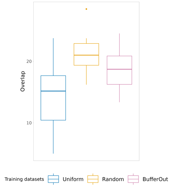
Sampling the absences across the range of climatic conditions instead, as we propose here, serves as an effective remedy to this sample location bias (i.e., sampling is skewed towards the most prevalent habitats within the geographical space, as observed in the example mentioned earlier) and reduce so-called class overlap (i.e., overlap between environmental conditions associated with species presences and pseudo-absences).

Easy to say that, of course, but in that freshly published paper we (or mainly: Daniele, Enrico and Manuele, the smart minds behind the paper) put these ideas to the test. The findings resoundingly endorse our approach: the ‘uniform’ environmental sampling method significantly reduces sample location bias and class overlap without sacrificing predictive performance. As such, it ensures that we can gather pseudo-absences adequately representing the environmental conditions available across the study area.

One of several figures in the paper hammering home the message that the Uniform approach is an improvement. Here, the reduction of class overlap is shown as compared with two other sampling methods in the geographical space.

Importantly, we go further than just sharing those insights. We also provide an R-package with the essential functions to implement the Uniform sampling method in your own workfloy. So, if you find yourself grappling with the challenges posed by presence-only species observation data when fueling your models, we encourage you to explore the new ‘USE’-package to collect a fair bunch of pseudo-absences!

Posted in General | Leave a comment

The true thermal niche of forest plant species

I might have mentioned this before*, but microclimate is crucial to improve our estimates of species distributions. As species are reacting to micro- rather than macroclimate, and both are at the local scale only very weakly correlated, ignoring microclimate could give highly erroneous species distribution estimates.

Conceptual representation of why microclimate matters for species distribution modelling. The use of macro- rather than microclimate data introduces a systematic bias (bottom middle), with the actual response curve being significantly different in shape.

Now, these things are easy to say, of course, and easy to argue theoretically. It’s an other thing altogether to actually proof them with real data. There are increasingly many regional studies doing just that**, however not that many are around to say that microclimate also matters at the large scale!

There is an argument for the hypothesis that it wouldn’t matter: across a whole continent like Europe, climatic gradients are so vast, that the difference between macro- and microclimate could perhaps in theory be overwhelmed by that macroclimatic gradient. That would make using microclimate data obsolete.

Nice try, paragraph just above, but the news is out that it actually DOES matter, even at that scale! That news comes in the shape of a new paper by lab member and SoilTemp forest data cruncher Stef Haesen, just published in Ecology Letters.

Forest understory microclimate is driven by both topography and vegetation cover. Picture: a valley with bluebells in a Flemish forest in early spring

What he did was comparing the performance of species distribution models (SDMs) built with micro- and macroclimate data. That microclimate data came from ForestClim, the European-wide high-resolution gridded microclimate product of forest understory temperatures (which he ALSO made, what a hero!).

The Ecology Letters paper now elegantly shows that microclimate-based SDMs at high spatial resolution outperformed models using both macroclimate, and microclimate data at coarser resolution. Additionally, macroclimate-based models introduced a systematic bias in modelled species response curves, which could result in erroneous range shift predictions.

A bit of a funny ‘spaghetti’-plot showing how microclimate-based models outperform macroclimate or aggregated microclimate-based models (with model performance here quantified using the ‘Continuous Boyce Index’, CBI’). Spaghettis depict the performance of models for each forest species that we modelled, the black line is the average.

In practice, the macroclimate models were – as predicted – unable to identify warm and cold refugia at the range edges of species distributions, the areas were microclimate was likely to be most important.

Modelled distribution for the typical forest plant Paris quadrifolia across Europe, with the black dots being its observations, and the blue-green-yellow gradient the modelled probability of occurrence. Circular maps on the right show model predictions at the cold (top) and warm (distributional limit, where the species is occurring more in respectively warmer (top) and cooler (bottom) refugia.

These findings elegantly show that, yes, microclimate is critical for SDMs, even at the continental scale. More importantly, perhaps, is the fact that if we want to use such models to find out where to conserve biodiversity, microclimate data is even more crucial: conservation often targets species at the edge of their distribution (refugia like these identified in the paper are increasingly at the forefront of conservation), where macroclimate-based models are thus performing the worst.

Paris quadrifolia at its northernmost limit in northern Norway, where the species clearly prefers warmer microhabitats

* Just joking; I effectively mention this every week or so! Even more, already in my PhD I had a whole paper dedicated to this point!

** Yes, even I wrote a bunch, like this one!

Posted in General, Science | Tagged , , , , , | Leave a comment

The vanguard

Here and there across the city of Antwerp, curious boxes with funny black noses are starting to appear. While their presence for now remains subtle, it heralds the exciting beginning of a new impending roller coaster ride of discoveries!

These boxes are smart sound sensors, designed to measure the variety of sounds in the urban context. They are the predecessors of a large citizen science project on sound and its impact on our lives; a collaboration between University of Antwerp, the Universitary Hospital (UZA) and media partner De Morgen, and I am proud and happy to be in charge of the scientific roll-out of this project.

The sound sensor is designed by ASAsense, a Belgian company, and its a nice, smart box: it sends data over the internet in real time to our database, but it also has a smart algorithm implemented, which allows it to identify the sources of sound it hears.

We’ve embarked on a preliminary journey ahead of the grand project scheduled for later this year. Our primary goal now is to capture the diverse urban soundscape using these sensors. We aim to collect data encompassing a wide range of sounds. Our team, including a group of dedicated students, will meticulously classify these sounds. This data will then become the basis for training machine learning models within the sensors to recognize specific sound patterns in our main project.

Our first foray into the real world yesterday already garnered media attention, including a detailed article in our media partner, De Morgen, and an engaging interview on regional radio and television.

Now it’s full speed ahead to the main project coming up soon!

Posted in General | Tagged , , , , , | 2 Comments

A correction and a warning

  1. A correction

Finally, we got to publish something that was véry long overdue: the necessary correction to our ‘Global maps of soil temperature’. A correction, indeed, as we had identified an error in the analyses that had to be rectified.

So, what happened? When calculating the monthly mean temperatures of each of the in-situ temperature time series from the SoilTemp database, I accidentally shifted these microclimate time series forward with half a month by using a faulty R-code. Or, in different words: I thought I had found a smart way to summarize the data to monthly values, but I didn’t… As this coding error did not occur when computing the corresponding monthly mean temperatures from the ERA5 macroclimate data, we ended up calculating our temperature offsets with half a month of temporal mismatch. The result was that the microclimatic offsets for let’s say June were calculated using the microclimate data from half of June and half of May instead.

Such a tiny error could have pretty major implications, so the moment we discovered this, we immediately dove back into the data to rerun our analyses. We were both lucky and unlucky. First, lucky: most of the analyses in the paper were at the yearly level, and there the implications of shifting the data with two weeks were minor: the corrected mean annual soil temperature was estimated to be on average only 0.006°C higher than the original one, with a Root Mean Square Error (RMSE) between the old and new map of just 0.330°C (Corrigendum Figure 1). Consequently, all conclusions in the main text of the published paper about biome-specific patterns in mean annual temperature remained unaffected (see below for details). 

Difference between the modeled mean annual temperature in the topsoil layer (SBio1) following the corrected (new) calculation versus the original (old) calculation were fairly minor. (a) Pixel-level differences in temperature (new minus old). (b) Temperature differences (new minus old) as a function of SBio1, showing more consistent lower temperatures in cold climates following the corrected calculations. (c) Histogram of errors in mean annual temperature.

Due to the nature of the error (a half-month shift in soil temperature time series), implications for seasonal bioclimatic variables were larger, however, especially in cold environments. That’s the unlucky part, as we had made our bioclimatic variables openly available, and people were thus using erroneous maps. We made sure to rectify that as soon as possible, and updated our maps on Zenodo, where one should use ‘version 2’.

The difference between the modeled maximum temperature of the warmest month following the corrected (new) calculation versus the original (old) calculation was substantially larger than in the figure above.

The urgency was lower to update the paper, due to the minor impact on the findings, but we wanted to do that as well, so the paper came with the necessary warning associated with it. That corrigendum is now online, bringing this saga to an end.

So how to prevent such errors in the future? I don’t know… This was a paper seen by so many people, this was data and code I had shared with several others. But the error was such a minor thing that looked reasonable at first glance, and the resulting data and patterns all looked so reasonable, that it was hard to spot. I guess I can only say: be as open as you can, share your data, share your code, and let people look at it all. The error came to light after a few back and forths with the lead author of a sister paper (Haesen et al. 2021, which also got a correction), who wanted to redo some calculations using new data for a follow-up analysis, and could not reproduce my numbers. That made me rerun my own numbers, and discover the mistake.

2. A warning

So are the maps now perfect? Far from! I want to take this opportunity to highlight another example of an issue that is still in the maps. It’s less of an error, but more a limitation of our data and analysis, and one that we can only correct by rerunning the analyses with a much larger dataset.

A while ago, a data user contacted us with a question: some parts of the global map of bioclimatic variable 3 (SBIO3) seemed impossible: SBIO3 is the isothermality, which is simply put the mean diurnal range (variation within a day, SBIO2) divided by the annual range (variation over a year, SBIO7).

Due to the nature of that index, it can not go below zero, as that would mean that any of these two ranges is negative, which would suggest a higher minimum than maximum temperature. Impossible!

Bicolor map of SBIO3, highlighting in green where impossible negative values were observed.

Now, it turned out that in a few cases, especially in the tropics, SBIO3 was indeed negative (see the map, around 3% of points across the globe)! This, in turn, was the result of a few negative values in SBIO2, the diurnal range. This can occur in our models in areas with very little difference in daily minimum and maximum, such as in warm and wet regions like the tropics. There, it is most likely the result of an extrapolation of our machine learning models of the underlying variables. Indeed, we did not inform any model of the fact that SBIO2 should never be below 0, as we calculated this range simply based on the separately modelled minima and maxima. Especially in very warm and wet areas – where diurnal ranges are low – it might therefore have extrapolated beyond what is possible in reality.

Such errors are amplified by the fact that SBIO3 is a derivative variable: it is calculated based on SBIO2 and SBIO7, with SBIO2 in turn being calculated based on our modelled minima and maxima. Each layer adds another opportunity for error, with the end result being less trustworthy than the input data. What is more, the models of minima and maxima themselves are the results of in-situ measurements and environmental explanatory layers, all in turn with their own errors.

So, while global modelling has great potential, one should never forget that such assessments – as so many – have inherent errors resulting from amplified uncertainties.

So what to do? The best is that when using SBIO3, one might consider to mask out these areas with impossible values. You can mask those erroneous pixels out directly, or get rid of all areas with potential uncertainties stemming from extrapolation of the model. We provide a mask for this, called ‘PCA_int_ext_5_15cm’ in the repository. When you take a very stringent threshold of 0.95, most of the erroneous areas are masked out, including several more that might have had enough accurate measurements to allow perfect modelling. 0.95 means that the model is doing at least 5% of extrapolation outside of the environmental space covered by the data.

image.png
Areas in green on this map are extrapolating for at least 5% of the environmental predictor layers, which could potentially result in such errors as described above – or at least a higher chance for those.


Posted in Science | Tagged , , , , , | Leave a comment

Going up the Andes

One day, a fantastic gift arrived from one of my Chilean colleagues: a compendium of non-native plant species in the country. Beautifully illustrated and brimming with clear information, I immediately found it to be a go-to resource for understanding ruderal vegetation back home… in Belgium.

A very typical Chilean roadside with a very typical European vegetation, dominated by an impressive individual of Verbascum thapsus

In Belgium, diving into the non-native flora of South America feels remarkably familiar, like returning home! The abundance of European ruderal species that have firmly established themselves – with the help of humans – in the Andes is mind-boggling. Dandelions (Taraxacum sp.), red and white clovers (Trifolium pratense and repens), Scotch broom (Citysus scoparius), Viper’s-bugloss (Echium vulgare), and simple street grass (Poa annua) – Chilean roadsides often appear surprisingly similar to their European counterparts.

High above the treeline on a beautiful Chilean mountain: Taraxacum officinale – the common dandelion. Probably arrived there in the footsteps of human hikers.

As you ascend the Andes, the number of these European weeds diminishes. However, the few that remain raise a vital question: to what extent does the problem of invasive species penetrate the breathtaking and valuable landscapes of the Andes?

The Andean flora is filled with unique native species – non-native species like the dandelion could become highly disruptive

Yet, as unfortunately still so often is the case, very little information existed. The concept of invasive species in mountains itself only recently caught the attention of ecologists, with the launch of the Mountain Invasion Research Network (MIREN) in 2005, marking a global first in addressing this question at a large scale. Since then, several important local studies have been undertaken in the Andes, with South American scientists playing an active role within MIREN. Despite these efforts, a comprehensive overview remained elusive.

As you can likely predict by now in this text, we embarked on a journey to fill this void. Local hero Eduardo Fuentes-Lillo, now deservedly Dr. Fuentes-Lillo, dug deep into the literature to consolidate all existing knowledge about plant invasions in the Andes – their patterns, drivers, and impacts. This endeavor unearthed intriguing truths, as you’ll discover in our latest paper.

Lead author Eduardo monitoring plant species along a Chilean mountain road

First and foremost, the patterns of non-native plant invasion in the Andes closely resemble those found in mountainous regions around the world. Lowland (often European) ruderal species follow disturbances uphill, gradually thinning until only the most adaptable species (like the dandelion) survive in the alpine zone.

In the Andes, just like elsewhere, anthropogenic disturbances play a pivotal role in driving these plant invasions. Where humans venture, especially along mountain roads, non-native species inevitably follow. And here’s the notable aspect: even at high elevations above the treeline, several non-native species thrive, including mimosa (Acacia dealbata), lupine (Lupinus polyphyllus), mullein (Verbascum virgatum), and bugloss (Echium vulgare), and the Andes seems to have surprisingly many of these examples. This surprisingly high non-native diversity at high elevations implies that climate serves less as a limiting factor for plant invasions in the Andes than one might anticipate; instead, disturbances enable these species to successfully establish above their expected limits.

Non-native species in the Andes relate more closely to disturbance – here caused by horseriding – than to climatic constraints

Ultimately, two important questions need to be answered: what impacts do these species have on the native Andean ecosystems, and what are we (or should we be) doing about them? Here lies a real challenge – we currently know very little about the impact of non-native species in the Andes, with only a handful of scattered studies touching upon a limited range of potential consequences. Clearly, there’s much work ahead!

Much of the information on non-native species impacts in the Andes is coming from research on Pines, one of the most impactful groups of invaders in the region

So, where do these findings lead us? The paper concludes with a strong warning message and a call to action: Andean countries have some catching up to do, particularly concerning impact studies, policy frameworks, and management. Achieving this ideal involves crucial cross-country communication, facilitating the optimization of strategies throughout the entire Andean region. Undoubtedly challenging, but as anthropogenic pressures on the Andes intensify and the climate warms, the risks, and impacts of non-native species in the Andes could rapidly escalate.

Posted in Argentina, Chile | Tagged , , , , , , , | Leave a comment

A climate change ecologists’ dream

It was a misty morning in the heart of July, yet the sky held the promise of turning into a brilliant blue canvas. Our team embarked on a short but steep hike to conquer the summit of mount Nuolja, setting out for an extraordinary day immersed in one of the most captivating long-term monitoring endeavors I have ever come across: the Fries-gradient.

Early morning on mount Nuolja, the alpine plants all draped in their most beautiful pearly dresses

Back in the years spanning from 1917 to 1919, Thore Fries dedicated himself to a meticulous scrutiny of the vegetation along a linear track from the mountain’s base to its rocky peak. With unwavering determination, he ascended and descended the mountain every five days throughout those three summers. Armed with an acute eye, he recorded each species he encountered, meticulously documenting their phenological stages – whether they were budding, flowering, producing seeds, or succumbing to the passage of time.

Fast forward to 2017, when a team of scientists from Abisko’s Climate Impact Research Center (CIRC), led by my friend and mentor Dr. Keith Larson, embarked on an audacious mission: to resurrect that century-old monitoring transect. This brilliant initiative, as you might intuitively feel, holds tremendous promise. A long-term investigation of this nature can furnish us with invaluable insights into the intricate interplay between climate change, species distributions, and phenology.

However, the reason why this long-term survey is even more special than others of its sort, is Thore Fries’ remarkable foresight during his era. He marked his trail with sturdy wooden poles, placed at regular intervals spanning from the mountain’s base to its top. A significant number of these poles endured the test of time, marking the exact survey locations even a century later. Thanks to additional careful documentation by Fries himself, the precise locations of the remaining markers were successfully deduced. The ‘Fries’-gradient thus stands as one of those exceedingly rare instances of century-old vegetation surveys where we are gifted with the EXACT coordinates of the original investigation.

In recent years, Fries’ old poles have been replaced by this beautiful sturdy fellows, made to last us another long while. This project truly has longterm ambitions!

In recent years, our team has joined forces with Keith’s, uniting our strengths to keep this monitoring endeavor alive. We have not only ‘pimped’ the gradient with our beloved microclimate sensors but are now also faithfully undertaking the pilgrimage to the mountain’s summit each summer, diligently observing and documenting the ever-changing plant life.

Our team hiking its way down along the transect

This year, we have master student Beau ready to dive into the wealth of data. Beau will capitalize on the astonishing fact that over the course of three summers in the 1910s and an additional seven summers in recent years, the plant species have been subjected to a watchful eye every five days. This cumulative effort has yielded a remarkable collection of nearly 300 vegetation surveys along the same transect. An unprecedented dataset, indeed, poised to address a long-standing query that has intrigued plant ecologists for generations: how frequently must we monitor a plot or region to observe all of its resident species?

Microclimate sensor on a rocky snowbed patch above the treeline, with the distinct ‘Lapporten’ mountain gap in the background

In many instances, constraints limit us to just one single visit to a given plot. Yet, due to a multitude of factors including seasonality, year-to-year fluctuations, observer bias, and numerous others, a singular survey often falls dramatically short of capturing the full spectrum of species within an area. We all know it – but there is little we can do about it.

There are many reasons why a species might escape our eyes. Beautiful flowering plants like this Campanula are hard to miss, but not all in the mountains is so outspoken in its beauty

How many revisits that takes, and which species are most often overlooked and when, that’s what Beau will try to find out. All this, of course, once we manage to tear our eyes away from the captivating vistas of mount Nuolja on a sunny summer day.

An alpine meadow filled with buttercups, overlooking lake Torneträsk
Posted in General, Sweden | Tagged , , , , , , , | 2 Comments