
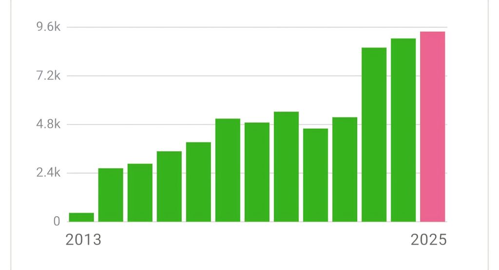
With the end of the year in sight, I always reflect a bit on this website and what it has achieved. Quite a shock to realize now that I’ve been blogging consistently for more than twelve years! Even better, the visitor statistics are still showing a steady increase. And yes, that genuinely makes me happy. It feels like quiet confirmation that all those hours spent writing and reflecting were not entirely in vain.
That feels like a good excuse for some reflection: what does it actually mean to blog as a scientist, and would I recommend it to others?
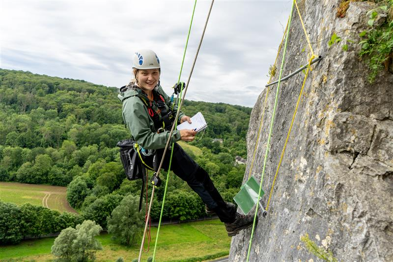
When I started the blog, I did so more or less on day one of my PhD. Unsurprisingly, there wasn’t much research output to talk about yet – because, well, the research still had to happen. In those early years, the blog had much more of a travel-magazine vibe. It was full of fieldwork stories and photos from the mountains, documenting places and adventures rather than results.
Slowly but surely, those travels turned into datasets, and those datasets turned into papers. At that point, the blog evolved with them. I made it a habit – also from day one – to write a blogpost about every paper on which I was a co-author. I often get the question where I find the time to do that, and honestly: it is often hard to squeeze into an already full schedule. But my thoughts have always been simple: if I can’t find two hours or so to summarize the key findings of a paper, why did I even bother contributing to it in the first place?
For me, blogging about published papers thus always – foolishly perhaps – trumps writing new ones. It’s a way of celebrating past wins before chasing the next deadline. Otherwise, it’s very easy to get stuck in a rat race where papers pile up but joy may disappear.
As my network grew, the audience of the blog grew with it. And I think providing this extra layer on top of a scientific paper – where I highlight what I find important – helps get the message across more clearly and, I hope, more convincingly. It reduces the risk of papers being forgotten and buried under the ever-growing avalanche of scientific output. Just as importantly, it helps reinforce the idea that each individual paper has value – to me, and to others – rather than being just another brick in a publication wall.
The blog has also given me space to tell stories that don’t fit neatly into the standard scientific paper format (like this one). Several of those posts have been among the most read. Early on in the ChatGPT hype, for instance, I wrote a post about how I perceived its pros and cons for research. Another well-visited piece dives into the surprisingly non-trivial question of which microclimate sensor to choose, a post I still occassionally share with people that ask me that question.
It’s also been an excellent platform to publicize new global research networks and invite people to join. That worked particularly well for initiatives like SoilTemp (now MEB) and EcoFracNet. One post I still hear about is the one where we offered free microclimate sensors to be installed in as remote places as possible, to help fill gaps in our global database. That kind of outreach simply doesn’t fit anywhere else as naturally.
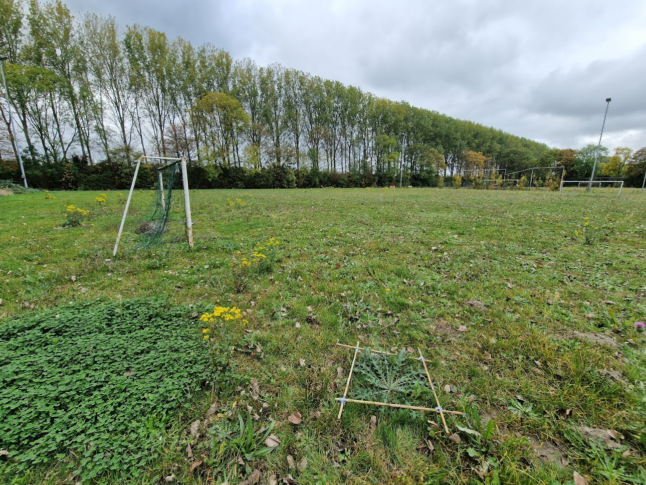
And yes, the blog still occasionally features fieldwork photos and travel reports – although I’m definitely less of a nature photographer now than I was during my PhD.
So, would I recommend blogging to other scientists?
In general: yes, if you’re comfortable with it being a slightly slower medium. Blogging works best when combined with other forms of outreach; otherwise it’s hard to get the word out. Twitter used to be ideal for that, and while I never really managed to recreate that dynamic elsewhere, LinkedIn has become the most workable alternative for now. It’s not the same, though.
One big advantage is that writing blogposts is surprisingly therapeutic. It forces you to slow down and really think about your published work. Even without a large audience, that process alone helps sharpen your understanding of the bigger picture you’re contributing to. You could post the same insights directly on social media, but to me that always feels fleeting.
So yes, I’ll keep on blogging. If only to keep forcing myself to think about what I want to tell people, and why I’m doing what I’m doing in the first place. And I hope you’ll stick around, keep reading, and occasionally stumble upon a useful nugget or two along the way.


")


")
")


")


")


")


")


")


