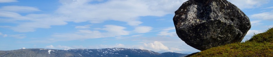
This year, I had the joy (and challenge) of teaching Ecology to first-year biology students at Utrecht University for the very first time. Nearly 400 students, fresh into their academic journey, dipping their toes into the fascinating, complex, and urgently important world of ecological research.
We wanted that first encounter to be more than just theory. We wanted it to be memorable, meaningful, and fun – a hands-on experience that brings global challenges close to home.
So, we launched a campus-wide Bioblitz.
A biodiversity sweep search through the Utrecht Science Park, designed to kill a whole bunch of birds with one stone – and it worked better than we imagined.
Here’s why we think it was awesome:
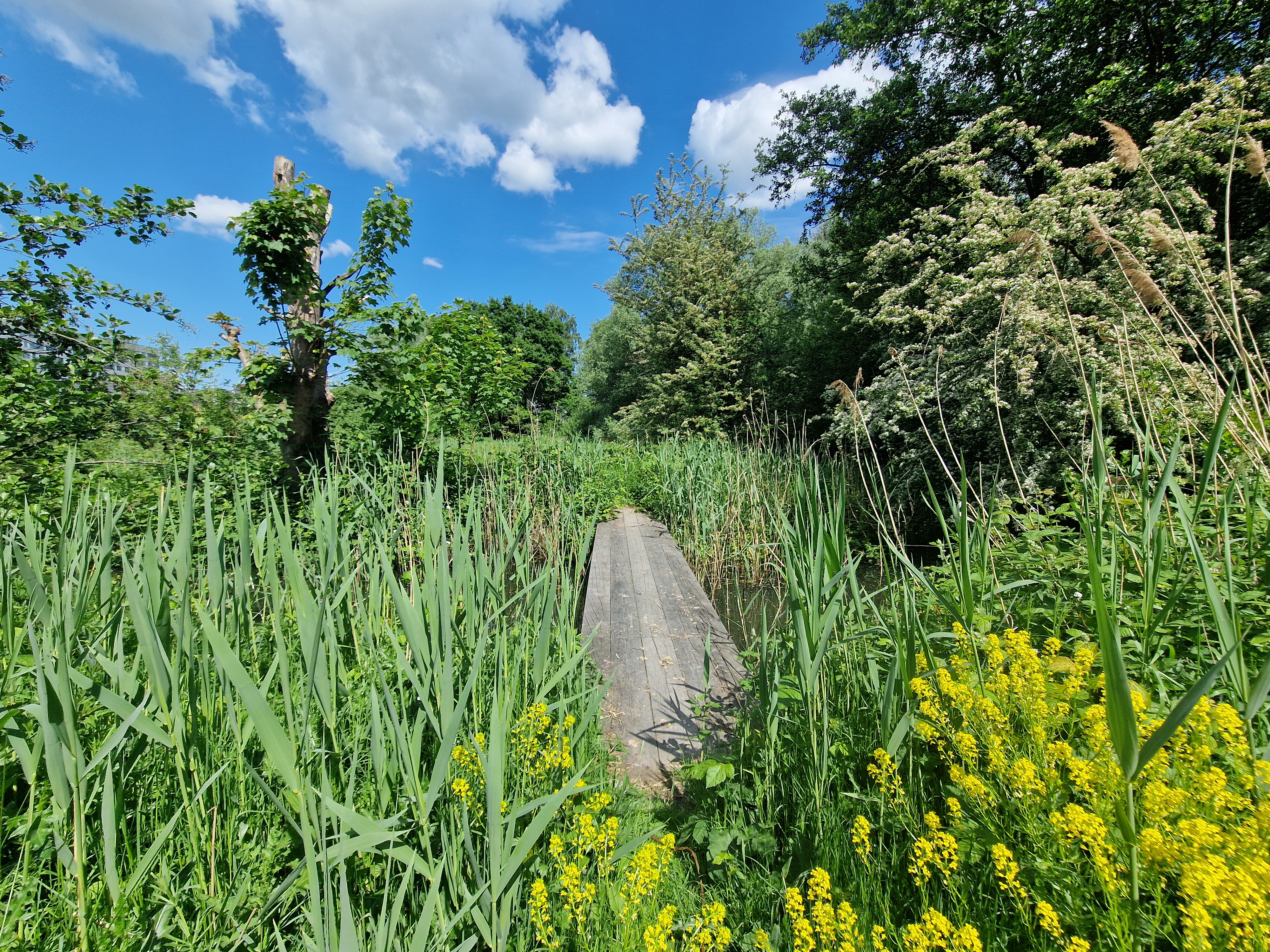
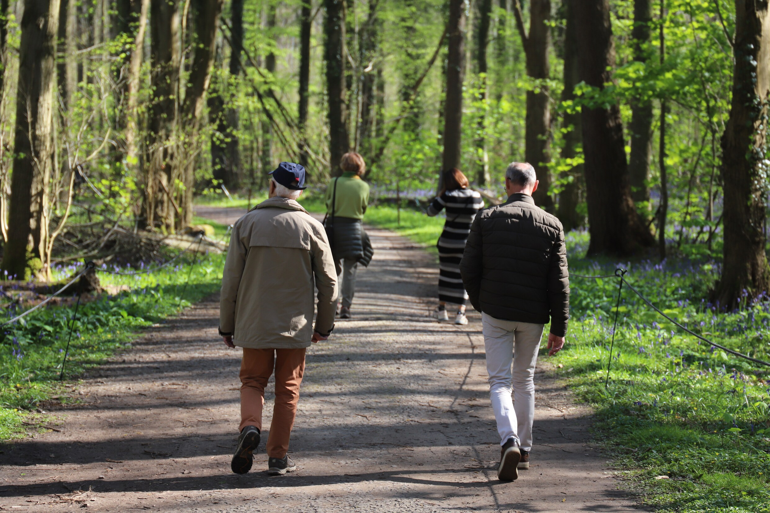
Real fieldwork, real biodiversity
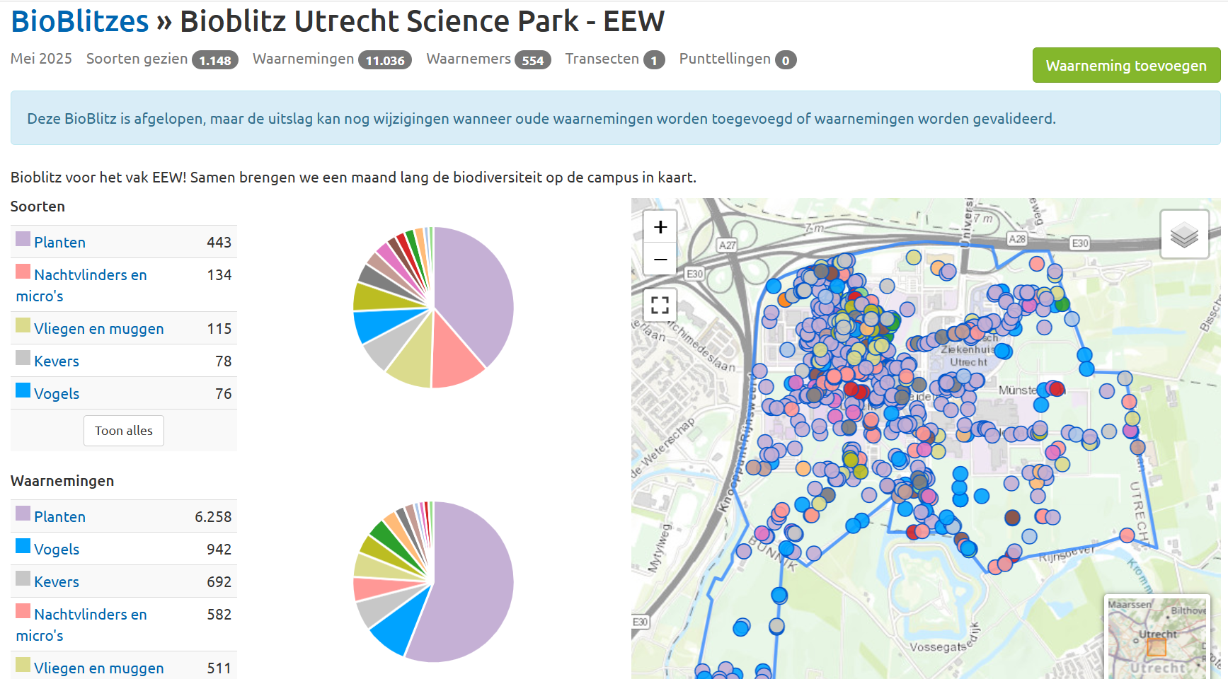
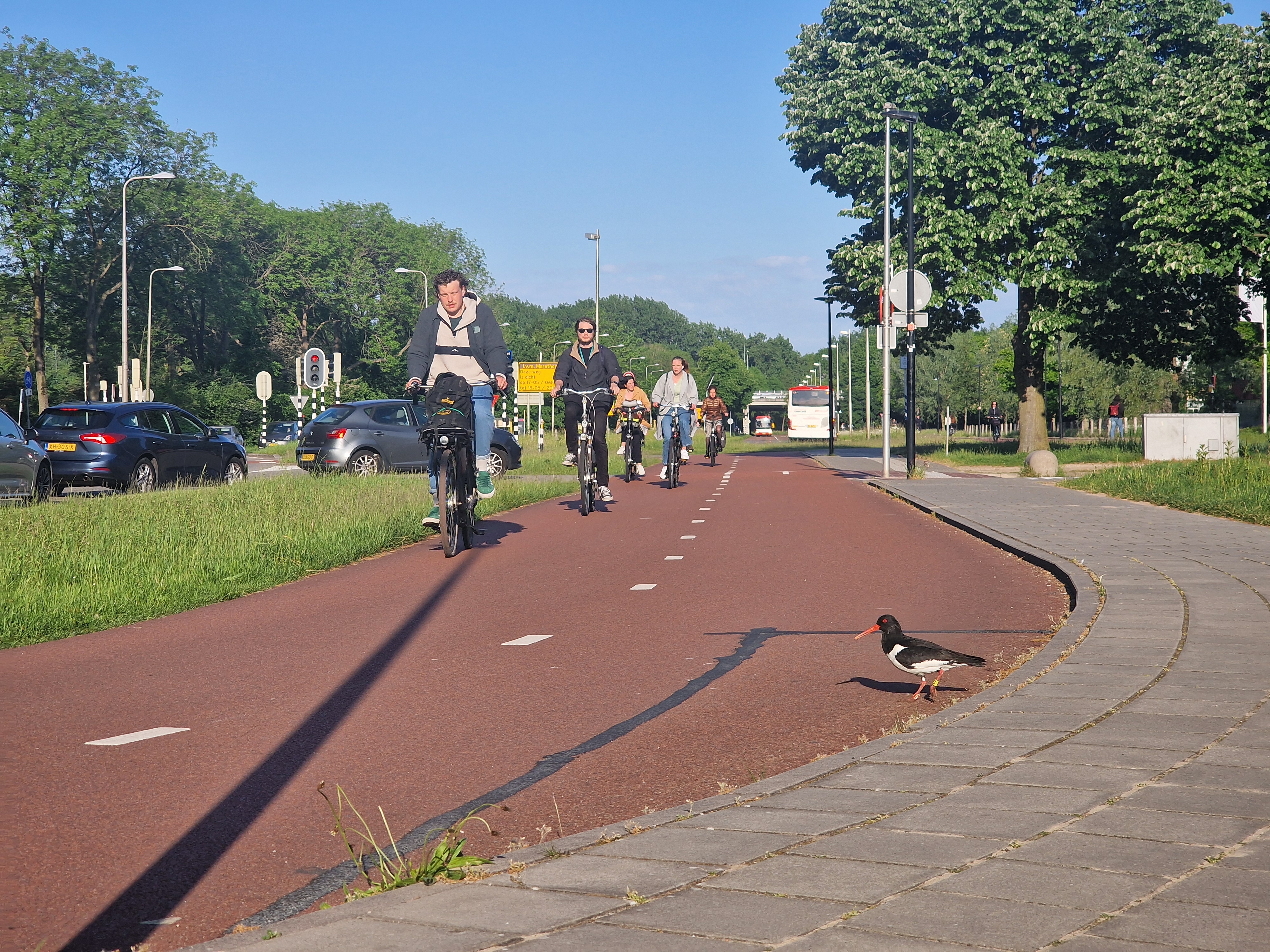
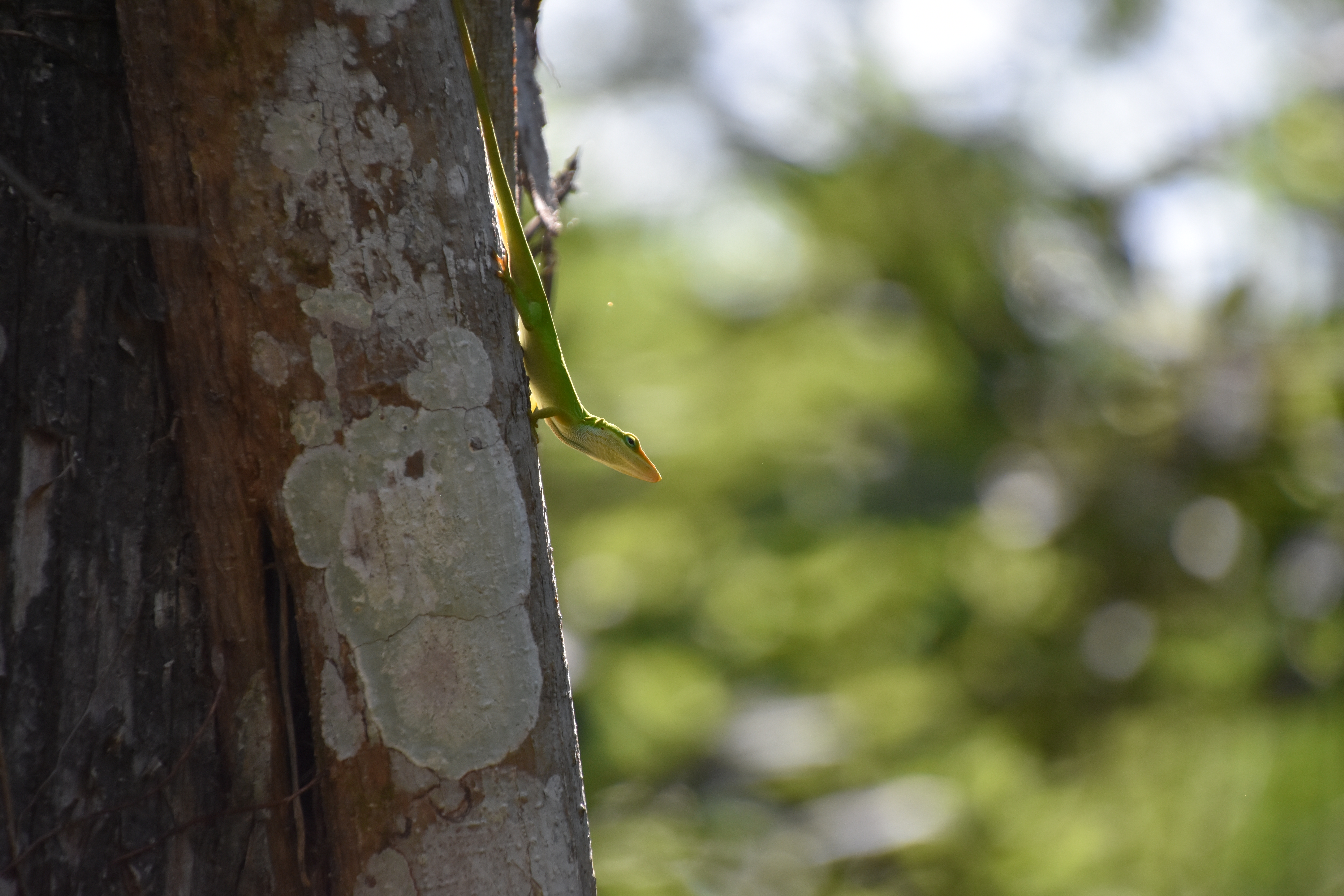
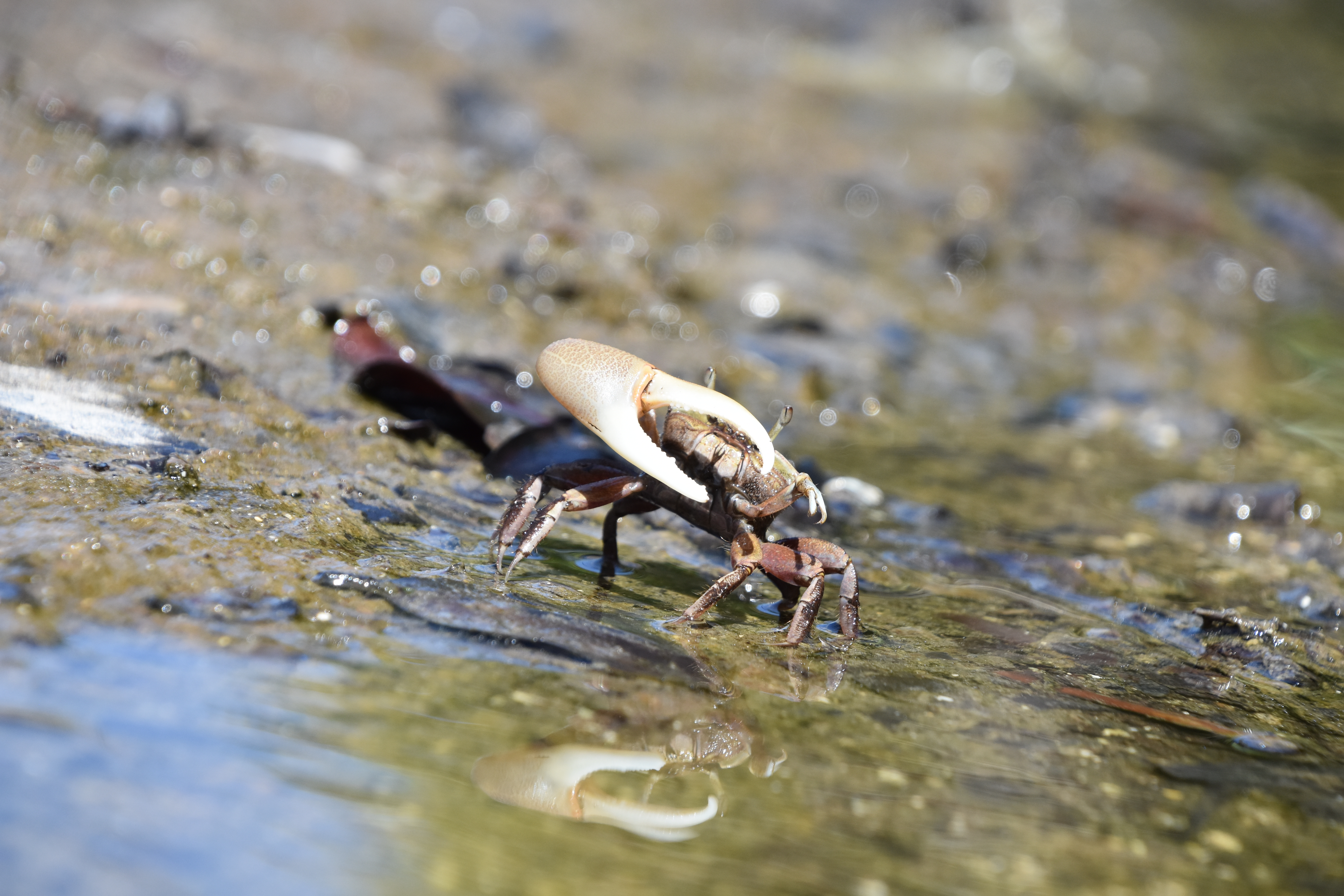
Students headed outdoors, explored patches of green around their classrooms, and surveyed the life blooming right under their noses. They were encouraged to contribute observations throughout May (much appreciated by the aspiring ecologists), with one full day of fieldwork required for everyone. No escape for that one day – even the future microbiologists were sent outside. The result? Over 1000 species of plants, animals, and fungi identified. An eye-opener, we hope, to the wildness still hiding on the doorstep.
Ecology made personal
By investigating biodiversity on their own campus, students saw up close why conservation matters – and how much there still is to discover and protect. From birds and beetles to mushrooms and mosses, the Science Park proved a microcosm of ecological diversity.
Linking science to action
Students also learned about the efforts already underway to conserve and restore biodiversity on campus – complex work, considering the competing pressures of research labs, student housing, and other infrastructure. We explored the messy realities of conservation in the real world: how it’s often under-prioritized, but still possible and worth fighting for. And perhaps even better: they could contribute to those conservation efforts. Thanks to all of them, we could scan the campus much more thoroughly, including corners where the usual ‘Bioblitzers’ wouldn’t go.
Theory meets the real world
A key course goal was helping students see how ecological theory underpins what we observe in nature. With the data from the Bioblitz, we discussed concepts like alpha, beta, and gamma diversity, and asked students to look for real examples of species interactions – predation, facilitation, mutualism, commensalism – right here on campus. We even tied this to the theories of conservation science, such as ecological corridor design linking green areas north, east, and south of the Science Park.
All in all, this Bioblitz turned out to be a brilliant all-in-one: fieldwork, biodiversity awareness, ecological insight, and local conservation impact, and an army of 400 scientists helping to gather data. Importantly as well: a perfect way to get that many students to do something meaningful, without having to spend a lot of resources on it.
Next year, we’re levelling up.
We plan to expand to soil biodiversity, moths, and aquatic life for those students who like a challenge. Stay tuned. Or better: join us with your own Bioblitz!


")


")
")


")


")


")


")


")


