
- A correction
Finally, we got to publish something that was véry long overdue: the necessary correction to our ‘Global maps of soil temperature’. A correction, indeed, as we had identified an error in the analyses that had to be rectified.
So, what happened? When calculating the monthly mean temperatures of each of the in-situ temperature time series from the SoilTemp database, I accidentally shifted these microclimate time series forward with half a month by using a faulty R-code. Or, in different words: I thought I had found a smart way to summarize the data to monthly values, but I didn’t… As this coding error did not occur when computing the corresponding monthly mean temperatures from the ERA5 macroclimate data, we ended up calculating our temperature offsets with half a month of temporal mismatch. The result was that the microclimatic offsets for let’s say June were calculated using the microclimate data from half of June and half of May instead.
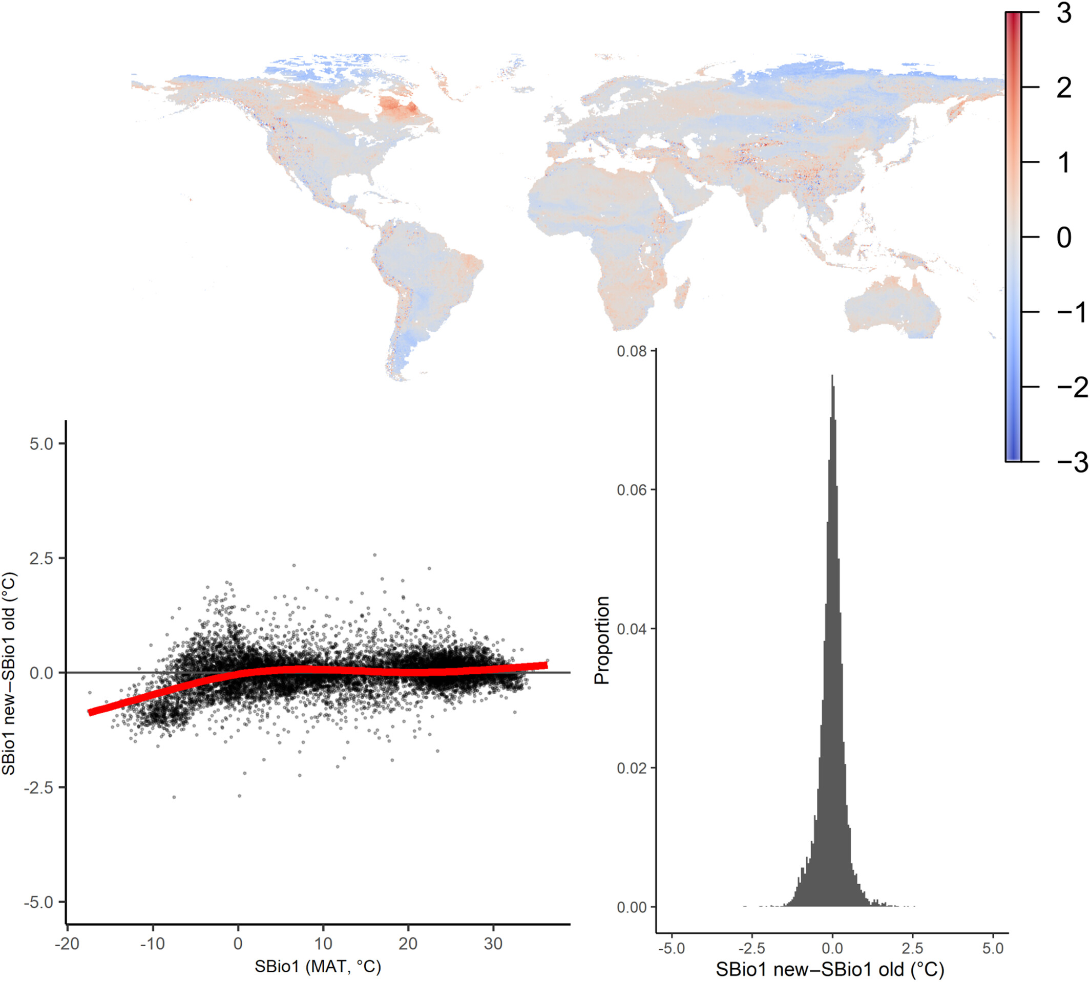
Such a tiny error could have pretty major implications, so the moment we discovered this, we immediately dove back into the data to rerun our analyses. We were both lucky and unlucky. First, lucky: most of the analyses in the paper were at the yearly level, and there the implications of shifting the data with two weeks were minor: the corrected mean annual soil temperature was estimated to be on average only 0.006°C higher than the original one, with a Root Mean Square Error (RMSE) between the old and new map of just 0.330°C (Corrigendum Figure 1). Consequently, all conclusions in the main text of the published paper about biome-specific patterns in mean annual temperature remained unaffected (see below for details).
Due to the nature of the error (a half-month shift in soil temperature time series), implications for seasonal bioclimatic variables were larger, however, especially in cold environments. That’s the unlucky part, as we had made our bioclimatic variables openly available, and people were thus using erroneous maps. We made sure to rectify that as soon as possible, and updated our maps on Zenodo, where one should use ‘version 2’.

The urgency was lower to update the paper, due to the minor impact on the findings, but we wanted to do that as well, so the paper came with the necessary warning associated with it. That corrigendum is now online, bringing this saga to an end.
So how to prevent such errors in the future? I don’t know… This was a paper seen by so many people, this was data and code I had shared with several others. But the error was such a minor thing that looked reasonable at first glance, and the resulting data and patterns all looked so reasonable, that it was hard to spot. I guess I can only say: be as open as you can, share your data, share your code, and let people look at it all. The error came to light after a few back and forths with the lead author of a sister paper (Haesen et al. 2021, which also got a correction), who wanted to redo some calculations using new data for a follow-up analysis, and could not reproduce my numbers. That made me rerun my own numbers, and discover the mistake.
2. A warning
So are the maps now perfect? Far from! I want to take this opportunity to highlight another example of an issue that is still in the maps. It’s less of an error, but more a limitation of our data and analysis, and one that we can only correct by rerunning the analyses with a much larger dataset.
A while ago, a data user contacted us with a question: some parts of the global map of bioclimatic variable 3 (SBIO3) seemed impossible: SBIO3 is the isothermality, which is simply put the mean diurnal range (variation within a day, SBIO2) divided by the annual range (variation over a year, SBIO7).
Due to the nature of that index, it can not go below zero, as that would mean that any of these two ranges is negative, which would suggest a higher minimum than maximum temperature. Impossible!
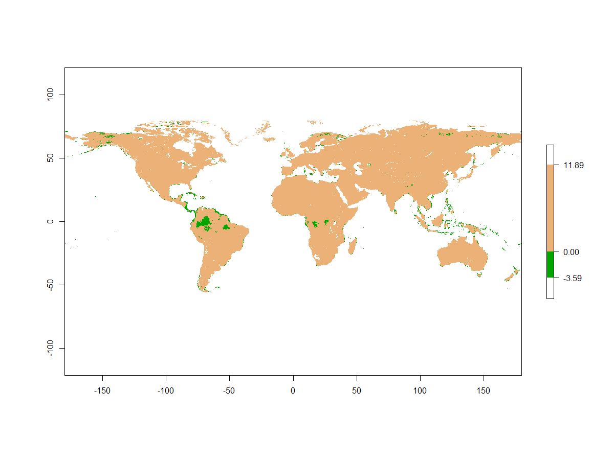
Now, it turned out that in a few cases, especially in the tropics, SBIO3 was indeed negative (see the map, around 3% of points across the globe)! This, in turn, was the result of a few negative values in SBIO2, the diurnal range. This can occur in our models in areas with very little difference in daily minimum and maximum, such as in warm and wet regions like the tropics. There, it is most likely the result of an extrapolation of our machine learning models of the underlying variables. Indeed, we did not inform any model of the fact that SBIO2 should never be below 0, as we calculated this range simply based on the separately modelled minima and maxima. Especially in very warm and wet areas – where diurnal ranges are low – it might therefore have extrapolated beyond what is possible in reality.
Such errors are amplified by the fact that SBIO3 is a derivative variable: it is calculated based on SBIO2 and SBIO7, with SBIO2 in turn being calculated based on our modelled minima and maxima. Each layer adds another opportunity for error, with the end result being less trustworthy than the input data. What is more, the models of minima and maxima themselves are the results of in-situ measurements and environmental explanatory layers, all in turn with their own errors.
So, while global modelling has great potential, one should never forget that such assessments – as so many – have inherent errors resulting from amplified uncertainties.
So what to do? The best is that when using SBIO3, one might consider to mask out these areas with impossible values. You can mask those erroneous pixels out directly, or get rid of all areas with potential uncertainties stemming from extrapolation of the model. We provide a mask for this, called ‘PCA_int_ext_5_15cm’ in the repository. When you take a very stringent threshold of 0.95, most of the erroneous areas are masked out, including several more that might have had enough accurate measurements to allow perfect modelling. 0.95 means that the model is doing at least 5% of extrapolation outside of the environmental space covered by the data.


")


")
")


")


")


")


")


")


