
Gather ‘round, my friends, because this one is important! A few years ago, we released our Global maps of soil temperature – a project that brought climate data much closer to the conditions that actually matter for the organisms living in and on the soil. However, and this is the important bit: some of our maps are physically impossible.
While defying physics sounds like a big no, I’d say it’s not truly a surprise (I already wrote about similar issues in a warning here). The first version of these maps was always meant as a stepping stone, a workable product that could get our data into the hands of ecologists worldwide, and would be a step up – but not yet a leap – from what we were using up till then. But now, thanks to some careful detective work by Tomas Uxa, we can actually quantify just how our maps break one of the basic rules of heat transfer in soils. His opinion paper on the matter in Global Change Biology is thus a must-read.
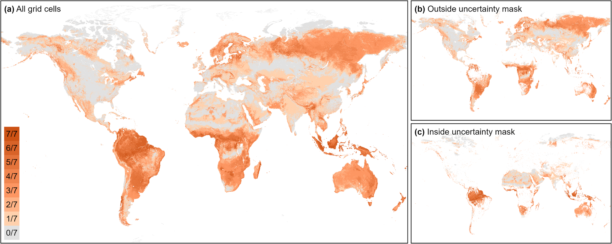
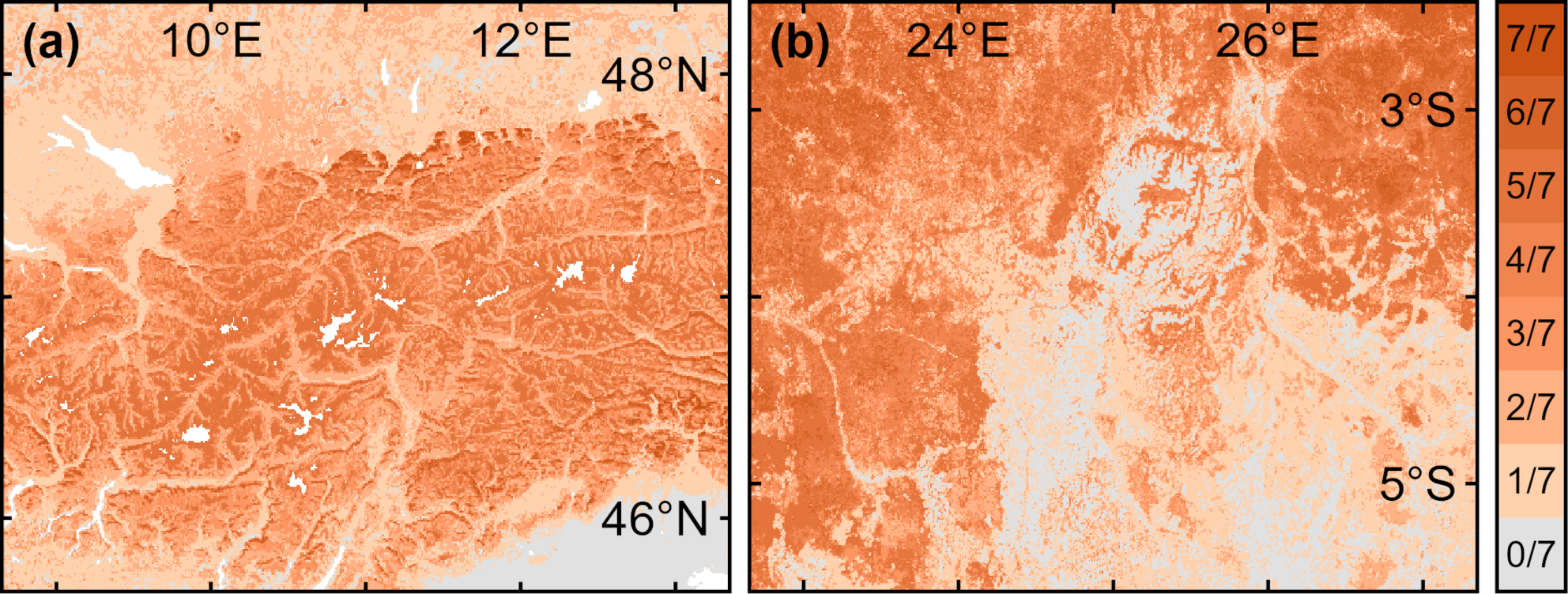
Here’s the deal: heat in soils behaves predictably. One key rule is that temperature fluctuations get smaller as you go deeper. Simple, right? Not (always) so in our maps. When comparing two soil depths, an average of 26% of the grid cells – and up to 46% for certain bioclimatic variables – showed reversed patterns. In other words, deeper soils sometimes had bigger temperature swings than shallower ones. Physically impossible (and also only present in less than 5% of the raw data).
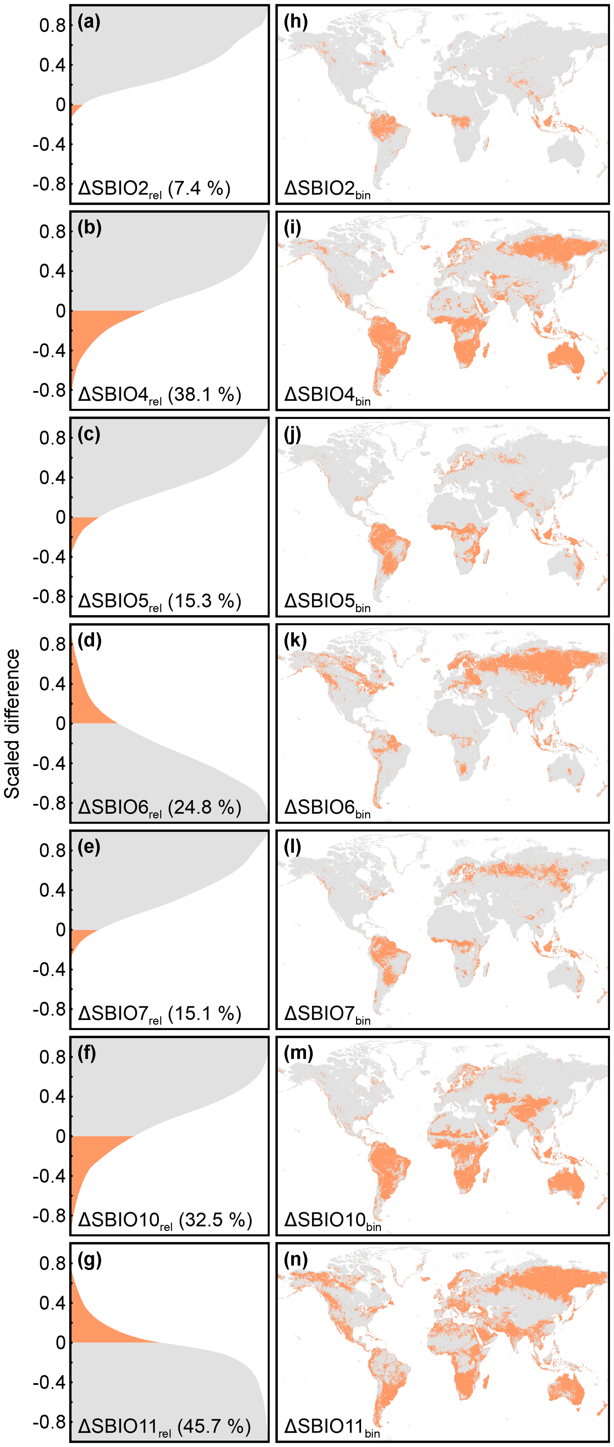
Why did this happen? To create our maps, we trained independent machine learning models for each soil depth. Separate models. Separate datasets. And while ML is amazing, it doesn’t inherently respect the laws of physics. The result: maps that are mostly useful, but occasionally rebellious.
Uxa’s recommendation is practical: the maps are still incredibly useful, but when working with multiple depths, use each depth separately and keep this caution in mind. Any analysis that relies on comparing the two depths directly may produce physically impossible results and should be avoided.
And the timing couldn’t be better. We’ve just in earnest started the work on the follow-up: Global maps of soil temperature 2.0, a new version that will hopefully solve many of the problems of its predecessor. The new version will incorporate over three times the data we had before, cover environmental variation better, and – crucially – move toward a one-model approach across depths and months. This should align our predictions more closely with physical reality. We’re also planning higher spatial resolution thanks to the explosion of computing power – so ecologists can finally get the detail that matters at scales that matter.
Up till then, a note of caution: handle our first-generation global soil maps (and really, any global maps) with care, and read Uxa’s piece to understand the quirks. And stay tuned… 2.0 promises to be a big leap forward.


")


")
")


")


")


")


")
")


